Page MenuHomePhabricator

[native] implement keyserver list ui
ClosedPublic

Authored by ginsu on Oct 31 2023, 1:17 AM.
Tags
None
Referenced Files
F3246629: D9642.id32640.diff
Fri, Nov 15, 1:03 AM
Unknown Object (File)
Wed, Nov 6, 7:18 PM
Unknown Object (File)
Oct 15 2024, 9:50 AM
Unknown Object (File)
Oct 15 2024, 9:50 AM
Unknown Object (File)
Oct 15 2024, 9:50 AM
Unknown Object (File)
Oct 15 2024, 9:49 AM
Unknown Object (File)
Oct 15 2024, 9:48 AM
Unknown Object (File)
Oct 15 2024, 9:29 AM
Subscribers

Details

Summary

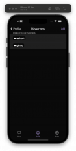
This diff introduces the UI for the keyserver selection list. For context here is a screenshot of the designs (please note, that elements like the connection indicator will be introduced in subsquent diffs)

Screenshot 2023-10-31 at 4.13.49 AM.png (1×764 px, 96 KB)

Linear task: https://linear.app/comm/issue/ENG-4913/update-keyserver-list-ui

Depends on D9641
Test Plan

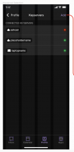
Please see the screenshots below (the second keyserver is just a test "dummy" keyserver I added to the keyserver store when testing the add keyserver flow)

Screenshot 2023-10-31 at 4.22.48 AM.png (1×944 px, 528 KB)

Diff Detail

Repository
rCOMM Comm
Lint
No Lint Coverage
Unit
No Test Coverage

Event Timeline

native/profile/profile.react.js
70 ↗(On Diff #32520)

Snuck this change in this diff after taking a second look at the designs are realizing this should say "Keyservers"

ginsu requested review of this revision.Oct 31 2023, 1:58 AM
rohan added inline comments.
native/profile/keyserver-selection-list.react.js
62 ↗(On Diff #32520)

Are you able to add some spacing on top of this label? Seems like it's there in the designs but not in the implementation

This revision is now accepted and ready to land.Nov 2 2023, 9:43 AM
native/profile/keyserver-selection-list.react.js
62 ↗(On Diff #32520)

We should try to keep the "panel" design consistent – if we make a change to it here, that change should be applied across all panels

native/profile/keyserver-selection-list.react.js
62 ↗(On Diff #32520)

Thanks for this catch @rohan, I will update the spacing at the top of the label and make sure that it is consistent with other user settings panels we have in our app. Here is a preview:

Screenshot 2023-11-02 at 2.45.09 PM.png (1×1 px, 696 KB)

Screenshot 2023-11-02 at 2.45.05 PM.png (1×1 px, 696 KB)

address comments + rebase before landing

This revision was automatically updated to reflect the committed changes.