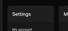
As I have been working on the redesign and have been converting our ui to utilize the new Panel component, I noticed that a lot of the headers followed a similar ui pattern. Rather than have this pattern be copied and pasted a bunch, I created this PanelHeader component that can be used to factor and abstract that logic out. The pattern I was noticing with the panel headers was that many panel headers either would just have the label, or they would have an optional add button.
Details
Details
- Reviewers
atul inka - Commits
- rCOMM77f4ba67d208: [web] introduce panel header component
Summary
Test Plan
flow + confirmed that there were no regressions with the app list header
Diff Detail
Diff Detail
- Repository
- rCOMM Comm
- Lint
Lint Not Applicable - Unit
Tests Not Applicable
Event Timeline
Herald added subscribers: tomek, ashoat. · View Herald TranscriptJan 11 2024, 5:31 PM2024-01-11 17:31:11 (UTC+0)
ginsu edited the summary of this revision. (Show Details)Jan 11 2024, 5:36 PM2024-01-11 17:36:06 (UTC+0)
ginsu attached a referenced file: F1055838: Screenshot 2024-01-11 at 12.33.09 PM.png. (Show Details)
ginsu attached a referenced file: F1055839: Screenshot 2024-01-11 at 12.33.30 PM.png. (Show Details)
ginsu attached a referenced file: F1055840: Screenshot 2024-01-11 at 12.32.56 PM.png. (Show Details)
ginsu attached a referenced file: F1055841: Screenshot 2024-01-11 at 12.33.52 PM.png. (Show Details)
ginsu attached a referenced file: F1055842: Screenshot 2024-01-11 at 12.33.21 PM.png. (Show Details)
Harbormaster completed remote builds in B25708: Diff 35549.Jan 11 2024, 5:55 PM2024-01-11 17:55:20 (UTC+0)
ginsu added a child revision: D10611: [web] introduce user settings list item.Jan 12 2024, 12:25 AM2024-01-12 00:25:54 (UTC+0)
This revision is now accepted and ready to land.Jan 12 2024, 8:27 PM2024-01-12 20:27:41 (UTC+0)
Closed by commit rCOMM77f4ba67d208: [web] introduce panel header component. · Explain WhyJan 18 2024, 5:27 PM2024-01-18 17:27:03 (UTC+0)
This revision was automatically updated to reflect the committed changes.


