Page MenuHomePhabricator

[web] introduce panel header component
ClosedPublic

Authored by ginsu on Jan 11 2024, 9:31 AM.
Tags
None
Referenced Files
F2196867: D10610.diff
Fri, Jul 5, 1:46 PM
F2193857: D10610.diff
Thu, Jul 4, 11:44 PM
Unknown Object (File)
Wed, Jul 3, 7:47 AM
Unknown Object (File)
Mon, Jun 24, 12:18 AM
Unknown Object (File)
Sun, Jun 23, 11:25 PM
Unknown Object (File)
Thu, Jun 20, 1:19 AM
Unknown Object (File)
Tue, Jun 11, 10:08 AM
Unknown Object (File)
Tue, Jun 11, 10:08 AM
Subscribers

Details

Summary

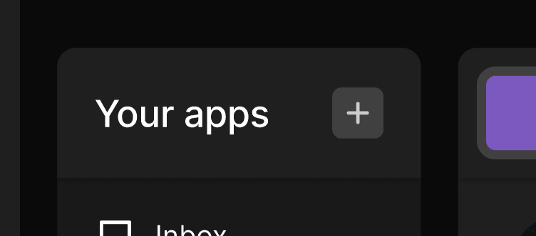
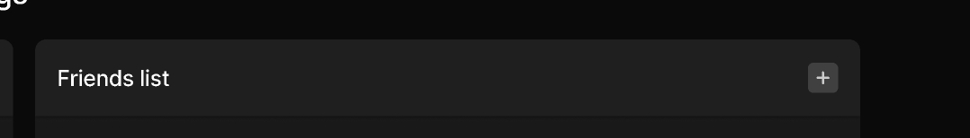
As I have been working on the redesign and have been converting our ui to utilize the new Panel component, I noticed that a lot of the headers followed a similar ui pattern. Rather than have this pattern be copied and pasted a bunch, I created this PanelHeader component that can be used to factor and abstract that logic out. The pattern I was noticing with the panel headers was that many panel headers either would just have the label, or they would have an optional add button.

Screenshot 2024-01-11 at 12.33.21 PM.png (214×1 px, 17 KB)

Screenshot 2024-01-11 at 12.33.52 PM.png (230×1 px, 20 KB)

Screenshot 2024-01-11 at 12.32.56 PM.png (332×752 px, 21 KB)

Screenshot 2024-01-11 at 12.33.30 PM.png (172×372 px, 10 KB)

Screenshot 2024-01-11 at 12.33.09 PM.png (154×1 px, 12 KB)

Test Plan

flow + confirmed that there were no regressions with the app list header

Diff Detail

Repository
rCOMM Comm
Lint
No Lint Coverage
Unit
No Test Coverage

Event Timeline

ginsu requested review of this revision.Jan 11 2024, 9:55 AM
This revision is now accepted and ready to land.Jan 12 2024, 12:27 PM
This revision was automatically updated to reflect the committed changes.