Linear issues: https://linear.app/comm/issue/ENG-2397/community-drawer-colours
https://linear.app/comm/issue/ENG-2343/style-the-navigation-drawer-on-native
https://linear.app/comm/issue/DES-10/design-for-light-mode-on-native
Designs: https://www.figma.com/file/WmS4u84vnveHHCcZusn5A4/%E2%9A%A1%EF%B8%8F-Mobile-App-Sidedrawer?node-id=4429%3A32903&t=tqg2p8kNEmavnWil-0
https://www.figma.com/file/L675ETKDnGaSwlpZAw4MIC/Mobile-App?node-id=3598%3A52104&t=SscXfXRNOzPWSkDp-0
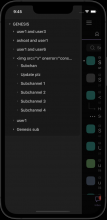
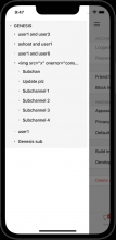
I realised thanks to the light mode designs that drawer item labels on different levels are supposed to be styled differently. This will require a non-trivial amount of changes, so I'll do this in the
next diff. In this diff all labels are styled like the items representing communities.
HitSlop on TouchableOpacity for expand buttons were determined by testing on physical devices.

