Page MenuHomePhabricator

[native] style SidebarListModal, SubchannelsModal, ThreadListModal
ClosedPublic

Authored by inka on Dec 28 2022, 8:45 AM.
Tags
None
Referenced Files
Unknown Object (File)
Sat, Apr 6, 2:48 PM
Unknown Object (File)
Wed, Apr 3, 9:31 PM
Unknown Object (File)
Wed, Apr 3, 9:31 PM
Unknown Object (File)
Wed, Apr 3, 9:31 PM
Unknown Object (File)
Wed, Apr 3, 9:31 PM
Unknown Object (File)
Wed, Apr 3, 9:30 PM
Unknown Object (File)
Wed, Apr 3, 9:14 PM
Unknown Object (File)
Mon, Apr 1, 5:48 PM
Subscribers

Details

Summary

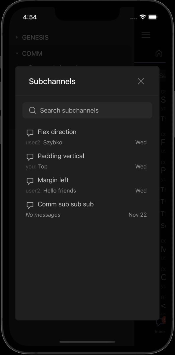
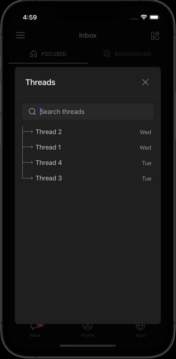
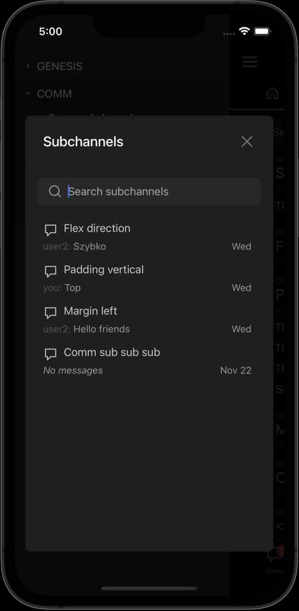
Linear issues: https://linear.app/comm/issue/ENG-2547/restyle-sidebarlistmodal-and-subchannelslistmodal, https://linear.app/comm/issue/DES-20/designs-for-subchannels-modal
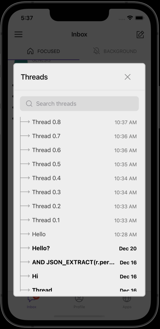
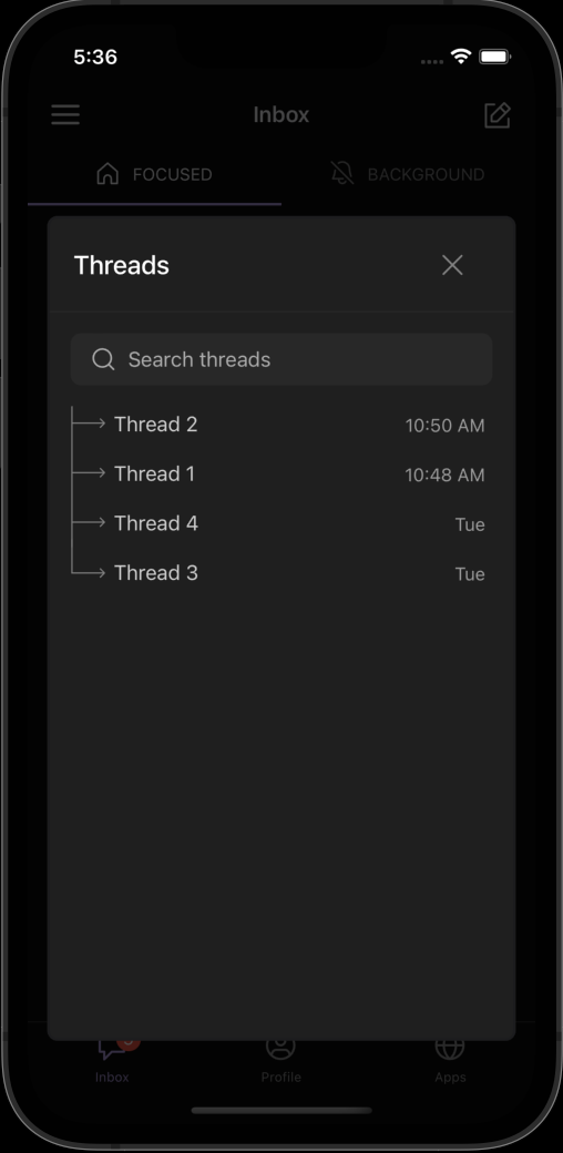
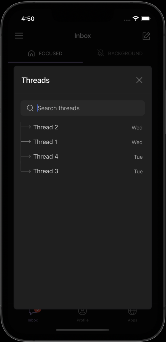
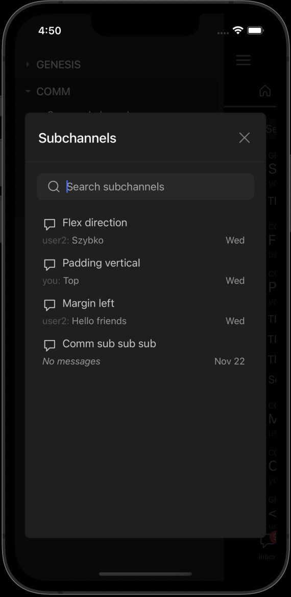
SidebarListModal, SubchannelsModal use ThreadListModal undeneath, and no other component uses ThreadListModal. SidebarListModal and SubchannelsModal are supposed to look consistent, and match the new designs provided in the second linked issue.

Screenshot 2022-12-28 at 17.37.19.png (1×516 px, 108 KB)

Screenshot 2022-12-28 at 17.37.58.png (1×512 px, 100 KB)

Screenshot 2022-12-28 at 17.36.54.png (1×516 px, 65 KB)

Screenshot 2022-12-28 at 17.36.33.png (1×514 px, 82 KB)

Screenshot 2022-12-28 at 17.36.20.png (1×508 px, 62 KB)

Test Plan

Run ios simulator, saw that the two modals look as expected. Chceked that scrolling works poperly.

Diff Detail

Repository
rCOMM Comm
Lint
Lint Not Applicable
Unit
Tests Not Applicable

Event Timeline

inka requested review of this revision.Dec 28 2022, 8:57 AM
tomek added a reviewer: ashoat.

Not sure if this is intentional, but x button seems to be shifted left. For me it would look better if the distance from the button to the right edge of the modal was the same as from the title to the left edge.

native/chat/subchannel-item.react.js
92 ↗(On Diff #20242)
native/chat/thread-list-modal.react.js
102–104 ↗(On Diff #20242)

When a lambda contains only a call to one function that has the same list of parameters, it can be skipped:

const f = () => {
...
};

const g = () => f();
is equivalent to
const g = f;

So in this case it could be simplified to just

const close = React.useCallback(navigation.goBack, [navigation]);

But in that case the memoization isn't needed at all.

110 ↗(On Diff #20242)
In D6073#182624, @tomek wrote:

Not sure if this is intentional, but x button seems to be shifted left. For me it would look better if the distance from the button to the right edge of the modal was the same as from the title to the left edge.

It looks a bit weird to me as well, but it's like that in the designs

image.png (860×806 px, 61 KB)

Addresss code review, rebase

In D6073#182751, @inka wrote:
In D6073#182624, @tomek wrote:

Not sure if this is intentional, but x button seems to be shifted left. For me it would look better if the distance from the button to the right edge of the modal was the same as from the title to the left edge.

It looks a bit weird to me as well, but it's like that in the designs

image.png (860×806 px, 61 KB)

I don't think this was intention of the designer. There is another screen https://www.figma.com/file/WmS4u84vnveHHCcZusn5A4/%E2%9A%A1%EF%B8%8F-Mobile-App-Sidedrawer?node-id=5867%3A35597&t=DDA32ZBjU7mH2PZC-0 where the button is in a different place, so I guess the placement is random.

Okay, here are some options then:

Here's how it looks with 'x' having the same right margin as the left margin of the title (margin 2 + 16 of header padding):

image.png (1×568 px, 175 KB)

image.png (1×570 px, 196 KB)

And here when the title is shifted to match the 'x' (margin 16 + 16 of header padding):

image.png (1×592 px, 192 KB)

image.png (1×588 px, 173 KB)

And here when the margins are 8 (margin 8 + 16 of header padding):

image.png (1×588 px, 172 KB)

image.png (1×588 px, 192 KB)

Any of those look good? @tomek @ashoat

For me the 1st option looks the best as the margin of header is consistent with other elements.

Agree, option 1 looks great!

This revision is now accepted and ready to land.Dec 29 2022, 8:16 AM