Issue: https://linear.app/comm/issue/ENG-2738/highlight-drawer-item
Designs this is needed for: https://linear.app/comm/issue/DES-3/designs-for-side-drawer-community-navigation-on-web,
https://www.figma.com/file/a1nkbWgbgjRlrOY9LVurTz/Comm-%2F-Desktop-app?node-id=7284%3A146198&t=CoLi2QV03acY7gv2-4
Before, drawer items had a margin left of 16, and all their children were being indented with them. So each next level had a margin equal to the margin of its parent + 16. But because we will want
to highlight drawer items, and the highlight is supposed to be almost as wide as the drawer, that approach will no longer work.
I will also not take the approach that I took for the styling of labels - where the styling was being determined in CommunityDrawerContent and passed down in the itemData prop, becaue the function
that is used to create itemData is used on both native and web, and native doesn't have a need for this change. Instead I'll have the drawer items take a padding prop. Each item will then pass its
padding value + 12 (not 16 because the designs have changed) to its children.
I don't love this solution, but it doesn't make native dependent on things it doesn't need, and works without requiring changes if we decide to increase the number of levels.
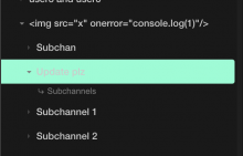
I highlighted an item to show how it is rendered now, but obviously without the colour:
