issue: https://linear.app/comm/issue/ENG-3044/change-apps-tab-to-be-a-modal
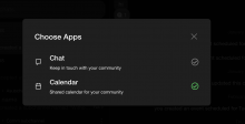
The Apps tab is changed to be a modal. Mind that the designs have changed a bit, see comments under the issue.
Details
- Reviewers
kamil • kuba michal - Commits
- rCOMMe4160e8a2f45: [web] Change apps tab to be a modal
Run web app, pressed the "+" button in the top bar, checked that a modal appears. Check that the modal displays correclty and it is possible to add / remove calendar as an app (the modal works
correctly)
Diff Detail
- Repository
- rCOMM Comm
- Lint
Lint Not Applicable - Unit
Tests Not Applicable
Event Timeline
| web/modals/apps/apps-directory-modal.react.js | ||
|---|---|---|
| 4 ↗ | (On Diff #22822) | This needs to be changed to import { useSelector } from '../redux/redux-utils.js';But this will break this file - in line 42 we rely on this being any-typed. So this will require more changes, thus I'll do this in a separate diff |
Looks great, only one question:
Isn't the gap between the header Choose apps and actual content with apps bigger on design than on the screenshot you provide?
| web/modals/apps/apps.css | ||
|---|---|---|
| 22 ↗ | (On Diff #22861) | |
| 47–57 ↗ | (On Diff #22861) | I find eg. padding-right: 20px; more readable but up to you |
| web/navigation-panels/topbar.react.js | ||
| 13 ↗ | (On Diff #22861) | |
| 25–27 ↗ | (On Diff #22861) | I can imagine the previous use of <a> has a purpose since it was changing the URL and redirecting the user to a different screen but in this case, it feels not appropriate to me. After clicking there is a certain action in the same location, so for me, it should be <button> (or to be precise our component <Button>). However, I've seen both in the codebase so deferring to you or other reviewers. |
Well the last design this is based on is not in figma, but a screen shot, so it's hard for me to tell what that space is exactly. But I maybe this is more similar:
| web/modals/apps/apps.css | ||
|---|---|---|
| 47–57 ↗ | (On Diff #22861) | This actually has a purpose, because both of these styles are applied to some items. So they are supposed to override one another. Doing it differently is possible, but not much better, so I'll leave it |
| web/navigation-panels/topbar.react.js | ||
| 25–27 ↗ | (On Diff #22861) | You're right. I'll change this in the diff that introduced this element: D6733 |
Address review, rebase. I also noticed that it's "Choose apps", not "Choose Apps", so fixing that as well
| web/modals/apps/apps-directory-modal.react.js | ||
|---|---|---|
| 32 ↗ | (On Diff #22960) | I prefer this one but here it doesn't change anything so up to you |
| web/modals/apps/apps.css | ||
| 7 ↗ | (On Diff #22960) | Why align-items is specified twice? |
| 47–57 ↗ | (On Diff #22861) | ahh correct, my oversight, sorry! |
| web/navigation-panels/topbar.react.js | ||
| 25–27 ↗ | (On Diff #22861) | |

