Page MenuHomePhabricator

[web] [fix] add icons with default paddings
ClosedPublic

Authored by benschac on Feb 28 2022, 9:41 AM.
Tags
None
Referenced Files
Unknown Object (File)
Wed, Jan 15, 7:18 PM
Unknown Object (File)
Mon, Jan 13, 6:52 PM
Unknown Object (File)
Wed, Jan 8, 8:36 PM
Unknown Object (File)
Wed, Jan 8, 8:36 PM
Unknown Object (File)
Wed, Jan 8, 8:35 PM
Unknown Object (File)
Wed, Jan 8, 8:28 PM
Unknown Object (File)
Fri, Dec 27, 8:29 AM
Unknown Object (File)
Fri, Dec 27, 8:29 AM

Details

Summary

Re-import icons with default paddings from icon pack.

Imported Icons

Image 2022-02-28 at 12.43.02 PM.jpg (1×3 px, 395 KB)

The diff is a little bigger because I had to delete all of the old icons and re-import but they got out of order. If it's a big deal I can go back and order the icons to their previous state.

Note: All of the icons will appear smaller now that paddings are added back to the fonts. Looking at the UI and figma they're now (almost) the correct size. The only exception that I found so far of icons that need to be updated in a follow-up diff are in the input (picture and send icons) which are linked in this stack. Additional icon size adjustments are addressed in following diffs in this stack.

Test Plan

inspect icons, they should have padding

Image 2022-02-28 at 12.38.50 PM.jpg (242×356 px, 10 KB)

This diff doesn't update layout or fix any sizing issues with imported icons. All it's doing is replacing the old icons without paddings with the icons that do have paddings.

I grepped the repo and updated every icon in the following diffs to address the updated icons with paddings.

Just confirming here all of the files that have <SWMansionIcon /> component. They have either been updated or currently match the design.

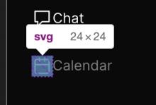
calendar.js: N/A there wasn't design for this page. No updates.
chat-input-bar: plus, send and image icons have been updated both in size and layout.
chat-thread-ancestors: cloud, and chevron-right icons have been updated to correct sizes
chat-thread-list-item-menu: menu-vertical is the correct size per figma designs.
chat-thread-list-item: is the correct size
chat-thread-tab: icons are updated to 24px, the correct size.
message-action-buttons: is correct size 18px.
message-reply-button: is correct size 18px.
sidebar-item: right angle arrow isn't a SWM icon (the long sidebar arrow), doesn't need to be updated.
thread-menu: menu icon has been updated to the correct size and button element padding has been removed.

Diff Detail

Repository
rCOMM Comm
Lint
Lint Not Applicable
Unit
Tests Not Applicable

Event Timeline

benschac edited the test plan for this revision. (Show Details)
ashoat requested changes to this revision.Feb 28 2022, 6:13 PM

@benschac, doesn't this lead to visual regressions because the paddings are changed? Should there be another diff in this stack that resets CSS to match? If so, please mention that sort of thing in the diff description! (Sorry if I missed it)

This revision now requires changes to proceed.Feb 28 2022, 6:13 PM

Seeing now that D3300 is part of the same stack, but you didn't set a "Depends On" relationship. Please always set the relationship between diffs you create

In D3299#88869, @ashoat wrote:

@benschac, doesn't this lead to visual regressions because the paddings are changed? Should there be another diff in this stack that resets CSS to match? If so, please mention that sort of thing in the diff description! (Sorry if I missed it)

It's lead to one visual regression that I have seen so far. I'm taking another look now and double-checking if anything looks off. I'll address any regressions in following diffs in this stack.

atul requested changes to this revision.Mar 2 2022, 8:01 AM

Are these icons duplicates of each other? Or is one intentionally smaller than the other?

3185-1.png (202×392 px, 78 KB)

Is there a reason we aren't importing the entire icon pack in one go?

(also noticed the "Filled" icon is still present, wouldn't this be the right time to fix the name of that icon as well?)

This revision now requires changes to proceed.Mar 2 2022, 8:01 AM
In D3299#89338, @atul wrote:

Are these icons duplicates of each other? Or is one intentionally smaller than the other?

3185-1.png (202×392 px, 78 KB)

Yes, one is intentionally smaller. I remember seeing them as different icons in figma.

Is there a reason we aren't importing the entire icon pack in one go?

Ideally, to not add icons we don't need. I don't think there are many more icons. I can look though the entire front-end and pull them out: https://linear.app/comm/issue/ENG-822/import-all-icons-from-swm-icon-pack

(also noticed the "Filled" icon is still present, wouldn't this be the right time to fix the name of that icon as well?)

(also noticed the "Filled" icon is still present, wouldn't this be the right time to fix the name of that icon as well?)

I don't think it is. The name of the icon is ''message-filled-round' per: https://phabricator.ashoat.com/D3294. If it wasn't changed from filled the icon wouldn't load.

It's lead to one visual regression that I have seen so far. I'm taking another look now and double-checking if anything looks off. I'll address any regressions in following diffs in this stack.

Please make sure your analysis to determine visual regressions is not based on a loose, general visual inspection, but rather is based on searching through the codebase (eg. git grep) for any and all codepoints that are affected by this change, and then doing a visual inspection for each individual location.

This will take more time but it is critical to avoiding regressions. You should always take great care to make sure your changes never introduce regressions.

ashoat requested changes to this revision.Mar 2 2022, 10:57 PM

Back to you – please update the test plan to reflect a thorough inspection of every single location in code that is affected by this change

This revision now requires changes to proceed.Mar 2 2022, 10:57 PM
In D3299#89575, @ashoat wrote:

Back to you – please update the test plan to reflect a thorough inspection of every single location in code that is affected by this change

I updated the test plan with every instance where the icon component is used. All changes are linked in the diff stack. Additionally, some of the icons were a bit off-center which I updated/corrected.

Ideally, to not add icons we don't need. I don't think there are many more icons. I can look though the entire front-end and pull them out: https://linear.app/comm/issue/ENG-822/import-all-icons-from-swm-icon-pack

IMO I think we should just add the entire icon pack and call it good so we can avoid having to do all this extra work just to use an icon.

We could look into using https://github.com/kamilagraf/react-swm-icon-pack?

they're all basically here, I just need to take another pass. Additionally, we probably still want to use Icomoon for the custom icons, no?

Thanks for the detailed test plan!!

This revision is now accepted and ready to land.Mar 3 2022, 10:32 PM