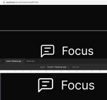
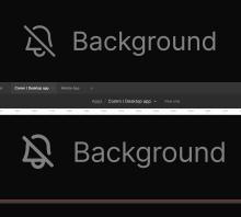
Align the chat tabs per the design. After re-sizing our icons, some of our icon layout css needed to be updated/fixed to match our design.
Details
Details
- Reviewers
atul ashoat - Commits
- rCOMMa76be33cbe9d: [web] [fix] chat tab icon alignment and spacing
Make sure chat tabs visually match the design.
https://www.figma.com/file/a1nkbWgbgjRlrOY9LVurTz/?node-id=1170%3A77104
Diff Detail
Diff Detail
- Repository
- rCOMM Comm
- Lint
Lint Not Applicable - Unit
Tests Not Applicable
Event Timeline
Comment Actions
Looks good, but think we can remove the span?
| web/chat/chat-thread-tab.react.js | ||
|---|---|---|
| 26 ↗ | (On Diff #10005) | Do we still need this span? It seems like it was previously being styled, but now it's not? Feel free to re-request review if I'm missing something! |
Comment Actions
remove span, use p tag
| web/chat/chat-thread-tab.react.js | ||
|---|---|---|
| 26 ↗ | (On Diff #10005) | updated, but added a <p> tag. I still think it's important to have some semantic html when there's text. |
| web/chat/chat-thread-tab.react.js | ||
|---|---|---|
| 26 ↗ | (On Diff #10005) | nvm, i think its fine. |


