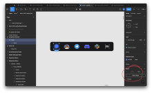
Based on some feedback received in D7905 and some discussion in the design channel we decided that a better way to get the competitor logo assets would be to bundle the svgs directly instead of fetching them over the network. To get the svgs I downloaded them straight from the Figma file and copy and pasted the svg contents into its own react component. In a subsequent diff I will make some modifications to each component to allow for a size prop so that we can modify the size of the logos depending on its usage.
Details
Rendered the logos on the landing page
Diff Detail
- Repository
- rCOMM Comm
- Lint
No Lint Coverage - Unit
No Test Coverage
Event Timeline
| landing/assets/comm-logo.react.js | ||
|---|---|---|
| 16 ↗ | (On Diff #26880) | In background-illustration.react.js the line length also extended past 80 characters |
| landing/assets/comm-logo.react.js | ||
|---|---|---|
| 10 | Noticed that the comm logo looked like this (on the right the circle gets cut off): I went into Figma and instead of exporting the frame with the logo, I just exported the group of assets and the value of the viewbox did change. However, the comm logo now looks like this: | |
Guessing the icons in Figma were sourced directly from each brand's "media kit" or whatever?
| landing/assets/comm-logo.react.js | ||
|---|---|---|
| 24–31 | ||
| landing/assets/comm-logo.react.js | ||
|---|---|---|
| 24–31 | ||
| landing/assets/comm-logo.react.js | ||
|---|---|---|
| 24–31 | Yo! When I was finding some assets for the Comm C Icon, I found some in the web app loading screen designs. https://www.figma.com/file/a1nkbWgbgjRlrOY9LVurTz/Comm-%2F-Desktop-app?type=design&node-id=6285-104248&t=DwoVfm5J4jahseeq-4 Those C SVGs do have a subtle gradient which I believe shows in our current loading screen. I don't think this gradient version shows up anywhere else, so we can remove it. | |


