Page MenuHomePhabricator

[landing] introduce competitor comparison
ClosedPublic

Authored by ginsu on May 30 2023, 11:41 AM.
Tags
None
Referenced Files
F3370657: D8034.diff
Tue, Nov 26, 3:35 AM
Unknown Object (File)
Mon, Nov 18, 10:51 AM
Unknown Object (File)
Sun, Nov 17, 2:19 AM
Unknown Object (File)
Sun, Nov 17, 1:36 AM
Unknown Object (File)
Sun, Nov 17, 1:36 AM
Unknown Object (File)
Sun, Nov 17, 1:36 AM
Unknown Object (File)
Sun, Nov 17, 1:36 AM
Unknown Object (File)
Sun, Nov 17, 1:36 AM

Details

Summary

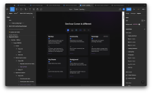
This diff introduces the Competitor comparison component. This is the first part of introducing the complete competitor comparison. This diff introduces the component and renders the header as well as the competitorSelector. The next diff will introduce the competitor cards to this component.

Designs:

Screenshot 2023-05-31 at 11.47.29 AM.png (1×3 px, 1 MB)

Depends on D8033

Test Plan

Please see the screenshots/demo videos below to see how everything looks/behaves:

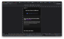
Desktop/Responsive/Behavior

Tablet:

Screenshot 2023-05-31 at 11.36.47 AM.png (2×3 px, 935 KB)

Mobile:

Screenshot 2023-05-31 at 11.36.41 AM.png (2×3 px, 885 KB)

Diff Detail

Repository
rCOMM Comm
Lint
No Lint Coverage
Unit
No Test Coverage

Event Timeline

Need to make one small adjustment to alignment of cards

broke this diff up into two diff so that this diff is not as large. This part introduces the competitor comparison section and the header for it. The next one will introduce the cards

ginsu edited the test plan for this revision. (Show Details)
ginsu added reviewers: atul, kamil.
ginsu added inline comments.
landing/competitor-comparison.css
48 ↗(On Diff #27300)

In the designs the width of the full size of the logos are 50px and the width of the full size bump is 40px. 4/5 = 0.8

landing/competitor-comparison.react.js
11–16 ↗(On Diff #27300)

This is the order shown in the designs:

Screenshot 2023-05-30 at 2.42.07 PM.png (230×994 px, 78 KB)

EDIT: see below, "elected" should be "selected"

landing/competitor-comparison.react.js
11–16 ↗(On Diff #27300)

This is subjective, but I think the logos that aren't elected are a little too dim?

cc @ted, @ashoat for thoughts

landing/competitor-comparison.react.js
11–16 ↗(On Diff #27300)

Hmm... I don't disagree...

Curious for @ted's take when he's back

This revision is now accepted and ready to land.Jun 1 2023, 11:06 AM
landing/competitor-comparison.react.js
11–16 ↗(On Diff #27300)

cc @ted

landing/competitor-comparison.react.js
11–16 ↗(On Diff #27300)

I can take a look with @ginsu tomorrow in the office with his build and the designs. Not married to the brightness and it can be brightened up!

bump opacity of not selected logos by 10%

This is what it looks like now:

Screenshot 2023-06-09 at 4.46.51 PM.png (362×1 px, 28 KB)

This revision was automatically updated to reflect the committed changes.