Page MenuHomePhabricator

[web] introduce light mode to community creation modal
ClosedPublic

Authored by ginsu on Dec 1 2023, 2:07 PM.
Tags
None
Referenced Files
Unknown Object (File)
Apr 8 2024, 5:32 AM
Unknown Object (File)
Feb 21 2024, 10:46 AM
Unknown Object (File)
Feb 21 2024, 10:19 AM
Unknown Object (File)
Feb 21 2024, 9:41 AM
Unknown Object (File)
Feb 21 2024, 8:04 AM
Unknown Object (File)
Feb 21 2024, 5:41 AM
Unknown Object (File)
Feb 20 2024, 7:02 PM
Unknown Object (File)
Jan 5 2024, 5:02 PM
Subscribers

Details

Summary

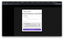
This diff introduces the new color design system/light mode to the community creation modal

For additional context about this new color design system and the new naming convention here is the notion doc:
https://www.notion.so/commapp/New-Color-System-Proposal-ef80b4e4b9ec42949095056161223a42

Linear task: https://linear.app/comm/issue/ENG-4807/community-creation-modal
Test Plan

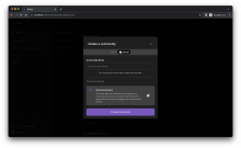
Please see screenshots:

dark:

Screenshot 2023-12-01 at 5.05.22 PM.png (1×3 px, 770 KB)

light:

Screenshot 2023-12-05 at 2.39.27 AM.png (1×3 px, 818 KB)

Diff Detail

Repository
rCOMM Comm
Lint
Lint Not Applicable
Unit
Tests Not Applicable

Event Timeline

web/sidebar/community-creation/community-creation-modal.css
30 ↗(On Diff #34160)

Confirmed that this style and the ones below are safe to remove

web/theme.css
95 ↗(On Diff #34160)

confirmed that this is safe to remove

259 ↗(On Diff #34160)

A subsequent diff will handle introducing the secondary variant

ginsu edited the test plan for this revision. (Show Details)
ginsu added reviewers: atul, inka, rohan.
ginsu requested review of this revision.Dec 1 2023, 2:27 PM

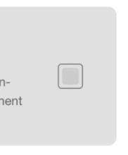
I think the selected checkboxes in light mode are really difficult to see personally, but maybe others disagree?

The light mode colors for all of these screens overall look pretty weird tbh

Code changes seem fine, but agree there is some weirdness visually

eg the contrast for the checkbox here:

b3fd4e.png (258×214 px, 6 KB)

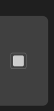
seems a lot lower than

904654.png (286×140 px, 5 KB)

could you double check to make sure the color values are correct.

If they are correct, we should probably just continue to get a "minimally viable light mode" and then consider tweaking color values at that point?

This revision is now accepted and ready to land.Dec 4 2023, 9:35 AM

address comments (increased the contrast for the checkbox and I amended the test plan to reflect this new change)

we should probably just continue to get a "minimally viable light mode" and then consider tweaking color values at that point?

Seems reasonable + should be pretty easy to do with this new color/theme system

This revision was landed with ongoing or failed builds.Dec 6 2023, 10:52 AM
This revision was automatically updated to reflect the committed changes.