Page MenuHomePhabricator

[native] [fix] [ENG-1123] update message chat bubble design to match design (more padding and line height)
AbandonedPublic

Authored by benschac on May 10 2022, 11:45 AM.
Tags
None
Referenced Files
F3353636: D3998.id12527.diff
Sat, Nov 23, 10:40 AM
F3353599: D3998.id12528.diff
Sat, Nov 23, 10:27 AM
F3353068: D3998.diff
Sat, Nov 23, 7:56 AM
Unknown Object (File)
Tue, Nov 19, 3:57 PM
Unknown Object (File)
Mon, Nov 11, 6:54 AM
Unknown Object (File)
Fri, Nov 8, 8:09 PM
Unknown Object (File)
Fri, Nov 8, 8:09 PM
Unknown Object (File)
Mon, Oct 28, 7:32 AM

Details

Summary

https://linear.app/comm/issue/ENG-1123/update-chat-bubble-design-to-match-figma, the message bubble needs to be updated so that the reply-engagement component isn't too cramped next to the text in the message bubble. Additionally, these changes are in line with mainstream messaging design.

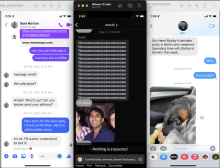
with chat bubble changes:

image.png (1×2 px, 2 MB)

without chat bubble changes:

image.png (1×2 px, 2 MB)

making @ashoat the blocking reviewer here because I know he'll have some feedback/comments since this change is highly visible.

Test Plan

review figma, and make sure this looks like the design.

Diff Detail

Repository
rCOMM Comm
Branch
inline-sidebar-web-and-native-ENG-530
Lint
No Lint Coverage
Unit
No Test Coverage

Event Timeline

native/chat/inner-text-message.react.js
143 ↗(On Diff #12528)

I actually think this is a bit too small. But that's what's in the design.

https://www.figma.com/file/L675ETKDnGaSwlpZAw4MIC/Mobile-App?node-id=351%3A455

@ashoat - I think 16px looks better.

image.png (1×2 px, 2 MB)

benschac retitled this revision from [native] [fix] [ENG-1123] update message chat bubble design to [native] [fix] [ENG-1123] update message chat bubble design to match design (more padding and line height).May 10 2022, 11:55 AM
benschac edited the summary of this revision. (Show Details)
ashoat requested changes to this revision.May 11 2022, 5:47 PM

We should not reduce text size like this. Can you sync with @atul to figure out an alternative to your concerns about the design? And then when you guys have a concrete proposal we can move forward

This revision now requires changes to proceed.May 11 2022, 5:47 PM

See here for some additional notes, basically making the chat bubbles look more like the Figma is a non-goal

See here for some additional notes, basically making the chat bubbles look more like the Figma is a non-goal

I chatted with @atul about this last week. I'm going to revert all changes regarding the chat bubbles. We thought possibly adding some padding to the bottom of the chat bubble where InlineEngadement is placed would help make the spacing look less cramped, but after reading your comment, that seems dangerous, with the possibility of more churn on this diff. I'm going to remove these changes from the stack. If things look cramped to you (@ashoat) then, let's address it.