Page MenuHomePhabricator

[native] [feat] [ENG-530] add new styles to inline sidebar component
AbandonedPublic

Authored by benschac on May 11 2022, 7:29 AM.
Tags
None
Referenced Files
F3376553: D4001.diff
Wed, Nov 27, 12:57 AM
Unknown Object (File)
Sat, Nov 23, 11:51 AM
Unknown Object (File)
Sat, Nov 23, 11:05 AM
Unknown Object (File)
Fri, Nov 15, 6:38 PM
Unknown Object (File)
Fri, Nov 15, 9:08 AM
Unknown Object (File)
Fri, Nov 15, 9:08 AM
Unknown Object (File)
Fri, Nov 15, 6:11 AM
Unknown Object (File)
Fri, Nov 15, 6:11 AM

Details

Summary

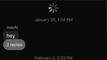
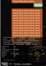
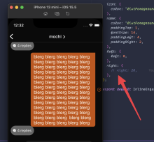
Add new styling to sidebar/reply in chat view.

received content + image:

CleanShot 2022-05-24 at 10.21.20@2x.png (1×724 px, 569 KB)

sent media + content:

CleanShot 2022-05-24 at 10.21.58@2x.png (1×722 px, 453 KB)

small amount to content:

CleanShot 2022-05-24 at 10.22.35@2x.png (244×720 px, 23 KB)

small with cluster:

CleanShot 2022-05-24 at 10.23.20@2x.png (318×728 px, 37 KB)

small received:

CleanShot 2022-05-24 at 10.24.03@2x.png (402×714 px, 37 KB)

Open questions:

  • When sliding a message reply doesn't change position:
    CleanShot 2022-05-24 at 10.25.19.gif (800×348 px, 4 MB)
    . That's the current functionality, but also the old inline sidebar was under the message, not positioned on a bottom overlap which makes this effect look odd. I think we should have the reply move with the animation. @ashoat, what're your thoughts. I can address it in the following diff.
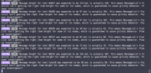
  • image.png (826×1 px, 315 KB)
    - this error was showing up before I created my stack. I can fix it up at the end of the stack if that makes sense.

Follow Up:

  • I still need to change the component name to match web, inline-sidebar --> inline-engagement-text.
  • handle 10+ replies.
Test Plan

Open messages review, inspect new design against figma: https://www.figma.com/file/L675ETKDnGaSwlpZAw4MIC/Mobile-App?node-id=344%3A491. A couple of thing to note:

Diff Detail

Repository
rCOMM Comm
Lint
No Lint Coverage
Unit
No Test Coverage

Event Timeline

There are a very large number of changes, so older changes are hidden. Show Older Changes
Harbormaster returned this revision to the author for changes because remote builds failed.May 11 2022, 7:30 AM
Harbormaster failed remote builds in B9004: Diff 12542!
benschac added a reviewer: ashoat.
benschac edited the summary of this revision. (Show Details)
benschac planned changes to this revision.
benschac added inline comments.
native/chat/composed-message.react.js
81 ↗(On Diff #12542)

I didn't need to change this, will update.

139 ↗(On Diff #12542)

this also didn't need to happen. Will revert.

benschac edited the summary of this revision. (Show Details)

self review

ashoat requested changes to this revision.May 11 2022, 6:05 PM

This only works with the changes in D3998 to reduce font size, which we shouldn't go forward with. Let's rethink this after we get that resolved

This revision now requires changes to proceed.May 11 2022, 6:05 PM
benschac retitled this revision from [native] [feat] [ENG-530] add new styles it inline sidebar component to [native] [feat] [ENG-530] add new styles to inline sidebar component.May 23 2022, 11:17 AM

move the inline engagement bar a bit to make more space.

Additionally, updated the screenshots to reflect the removal of D3998 (chat bubble design changes).

I moved the inline engagement bubble down a bit so the text doesn't get too close to it.

If this still looks off @ashoat, let's chat about what your envisioning.

ashoat requested changes to this revision.May 23 2022, 11:55 AM

Yeah, this does look like close to right!

  1. Can you also link the Figma so we can compare / contrast?
  2. The color looks off to me... what do you think? Is this what was in the Figma? Maybe I just feel that way since the emojis aren't there yet, but it feels a bit off... also curious for @atul's perspective
This revision now requires changes to proceed.May 23 2022, 11:55 AM

Yeah, this does look like close to right!

  1. Can you also link the Figma so we can compare / contrast?
  2. The color looks off to me... what do you think? Is this what was in the Figma? Maybe I just feel that way since the emojis aren't there yet, but it feels a bit off... also curious for @atul's perspective
  1. Link: https://www.figma.com/file/L675ETKDnGaSwlpZAw4MIC/Mobile-App?node-id=344%3A491
  2. Color:
    CleanShot 2022-05-23 at 15.03.07@2x.png (588×1 px, 113 KB)
    hex val: 666666, also confirming color from our theme file: https://github.com/CommE2E/comm/blob/master/native/themes/colors.js#L33. Also, the sign of my lord and team of ice sport begrudgingly support.
  3. for the text, it's white which is also here: listForegroundLabel --> https://github.com/CommE2E/comm/blob/master/native/themes/colors.js#L99

Going to put this back in your queue since I've answered your questions, but didn't make code changes.

Background color of the Figma doesn't seem to match the background color of the screenshot you linked. Can you make 1000% sure you're right about what you're claiming? If you're 1000% sure, can you see if see what I'm talking about? If you really don't see it, can you open both screenshots in some design app and use some tool to check what the actual color is? Sorry if I'm off here, but prior experience makes me strongly suspect I'm right... so I want to get a very strong confirmation I'm wrong before continuing

ashoat requested changes to this revision.May 23 2022, 12:12 PM
This revision now requires changes to proceed.May 23 2022, 12:12 PM

I imported the wrong color via the light theme. I'll come back and fix this tomorrow.

ashoat requested changes to this revision.May 24 2022, 7:07 AM

Can you update the screenshots please?

This revision now requires changes to proceed.May 24 2022, 7:07 AM

Just to be 100% sure the latest changes are correct:

CleanShot 2022-05-24 at 10.04.04@2x.png (1×726 px, 427 KB)

Also confirmed on digital color meter

benschac edited the summary of this revision. (Show Details)

updated screen shots.

ashoat requested changes to this revision.May 24 2022, 7:47 AM

Some questions inline

native/chat/composed-message.react.js
140 ↗(On Diff #13076)

Why is this necessary now but wasn't before?

native/chat/inline-sidebar.react.js
73 ↗(On Diff #13076)

Why do we need right: 20 but don't need left: 0?

This revision now requires changes to proceed.May 24 2022, 7:47 AM
native/chat/composed-message.react.js
140 ↗(On Diff #13076)

I ended up removing it in a previous diff: https://phabricator.ashoat.com/D3971 because there was a comment about removing positioning, which both you and @atul suggested.

And, made sense at the time. I was removing all of the stylings in relation to the component that was there before. So, those position props did nothing.

Now the new styling has been introduced, and we need to absolutely position each one of these components differently right and left or viewer and sender positions.

native/chat/inline-sidebar.react.js
73 ↗(On Diff #13076)

I'm pretty sure it has to do with how absolute positioning works. We could remove left: 0, and it would still work.

I'm not 100% how it works in react-native land. But on web absolute positioning defaults to top: 0, left: 0

https://codepen.io/benschac/pen/OJQxoYa

73 ↗(On Diff #13076)

which also seems to be the case with react-native.

Marking this as needs review so it gets back into @ashoat review queue. No code update but replied to question.

native/chat/composed-message.react.js
140 ↗(On Diff #13076)

Got it, thanks for clarifying!

native/chat/inline-sidebar.react.js
73 ↗(On Diff #13076)

But why isn't it left: 20 to match up with right: 20? I'm trying to understand why these are different. Does the design call for this difference?

Is it different because we're accounting for the deliveryIcon? If we're using 20 in multiple places, it feels like we should avoid hardcoding it and instead to put it as a constant somewhere. Even better would be if we structured the view hierarchy so that the delivery icon is outside of the InlineEngagement, but that might be really hard...

Definitely still possible that no changes are needed here, but requested changes again to get additional clarification

ashoat requested changes to this revision.May 24 2022, 12:28 PM
This revision now requires changes to proceed.May 24 2022, 12:28 PM

Answered questions, asking for review again to get this back in @ashoat's queue.

native/chat/inline-sidebar.react.js
73 ↗(On Diff #13076)

But why isn't it left: 20 to match up with right: 20? I'm trying to understand why these are different. Does the design call for this difference?

Without right:

CleanShot 2022-05-25 at 12.32.46@2x.png (1×1 px, 550 KB)

Absolute position is default top: 0, left: 0 in reality. Technically it's all auto, but top: 0, left: 0 is how it behaves, shown in the codepen linked above: https://codepen.io/benschac/pen/OJQxoYa. If we define a right: <number> the element will position right <number> pixels of the closest relative positioned parent element.

left: 0 is because the element that's the relative parent is still pushed off the edge of the screen by some margin. So, there's no additional need to move it farther.

If we add left: 20

CleanShot 2022-05-25 at 12.38.22@2x.png (1×1 px, 458 KB)

the other thing to account for is left doesn't have the send check icon that right does have.

ashoat requested changes to this revision.May 25 2022, 2:43 PM

All of the items in the native ChatMessageList need to have their vertical height measured. Some questions about that:

  1. How did we previously account for InlineSidebar? Was the height of this elevant ever measured anywhere?
  2. What is the plan for measuring the height of these new elements?

Separately, another thing I noticed from your screenshot: part of our chat design is to make sure that the corners of messages in a "cluster" that touch each other aren't rounded. This makes the messages in the cluster look good together visually. But sticking an InlineEngagement in between seems to make this not really work visually. Should we change the code to round these corners if there is an InlineEngagement in between? If you agree, can you create a Linear task and respond here with the task number?

Note: before responding to this comment, it might be best to chat with @atul. There's a lot of complexity in what I'm asking about here, and unfortunately I don't have all of the time to delve into it with you in this comment. But I suspect you'll need some help in order to answer these questions fully.

Additionally: if you have any follow-up questions regarding this comment, it would be great if you could run them by @atul first.

native/chat/inline-sidebar.react.js
73 ↗(On Diff #13076)

This is the only relevant part of your response:

the other thing to account for is left doesn't have the send check icon that right does have.

I guessed that this was the case, and so preemptively asked you some follow-up questions in my previous comment. Can you please respond to those follow-ups? For convenience, I will quote them here:

Is it different because we're accounting for the deliveryIcon? If we're using 20 in multiple places, it feels like we should avoid hardcoding it and instead to put it as a constant somewhere. Even better would be if we structured the view hierarchy so that the delivery icon is outside of the InlineEngagement, but that might be really hard...

Definitely still possible that no changes are needed here, but requested changes again to get additional clarification

This revision now requires changes to proceed.May 25 2022, 2:43 PM

Resigning temporarily to give @benschac and @atul some space to iterate / discuss my feedback. Once you are both in agreement that the feedback / questions have been addressed, can you add me back in?

This revision now requires review to proceed.May 25 2022, 2:44 PM

Some time ago @ashoat asked @benschac and @atul to iterate on it. Would it make sense for @atul to commandeer this diff?

Some possibilities:

  1. @atul could take this on and try to close out ENG-530 if he has cycles
  2. Alternately, @abosh could take it on
  3. @dereknelson is pretty excited about Reactions, and this ties in there so could be a good place to start for that. But he's currently working on Sign-In With Ethereum, so might be a while before he can take it on
ashoat requested changes to this revision.Jun 21 2022, 9:57 AM

Removing from people's queues

This revision now requires changes to proceed.Jun 21 2022, 9:57 AM
atul edited reviewers, added: benschac; removed: atul.

(Copied from D3893)

@jacek I think we can abandon these changes since you've started a separate stack to deal with InlineSidebar. Let me know if I'm mistaken and I can re-open this if it tracks some unique work.

atul foisted this revision upon benschac.
atul edited reviewers, added: atul; removed: benschac.