Page MenuHomePhabricator

ted (Ted Chang)
Disabled

Projects

User does not belong to any projects.

User Details

User Since
May 15 2023, 10:01 AM (79 w, 3 d)
Roles
Disabled

Recent Activity

Sep 27 2023

ted attached a referenced file: F776853: RPReplay_Final1695836467.MP4.
Sep 27 2023, 10:59 AM
ted added inline comments to D9286: [native] make user profiles accessible from RelationshipListItem.
Sep 27 2023, 10:59 AM

Aug 25 2023

ted added a comment to D8860: [web] introduce getTooltipScreenOverflowRightCorrection function.
In D8860#263537, @ginsu wrote:

Are you sure that overlapping thread list a bit is okay?

Currently all our tooltips do this, so I thought it was okay to keep this consistent behavior.

Screenshot 2023-08-24 at 5.43.06 PM.png (2×3 px, 1 MB)

Screenshot 2023-08-24 at 5.43.13 PM.png (2×3 px, 1 MB)

Curious for Ted's take
cc @ted

Aug 25 2023, 10:53 AM

Aug 22 2023

ted added a comment to D8821: [web] Create a new 'secondary device' screen that will generate the QR code.

Is there a way we can try to make this actually match the style of the main "Sign in to Comm" modal? It frankly looks completely different, in terms of color scheme, navigation, organization, etc. I think we need to do some more work on the design here, but open to landing this diff to unblock Rohan for the time being

Aug 22 2023, 7:39 AM

Aug 21 2023

ted attached a referenced file: F700235: QR Code Design Pass.png.
Aug 21 2023, 8:58 AM
ted added a comment to D8821: [web] Create a new 'secondary device' screen that will generate the QR code.
In D8821#261544, @rohan wrote:
In D8821#261190, @ted wrote:

Thanks for the tag! I do agree that rounding the corner of the box will be better here. Our corner radiuses that we have been using is 8px.

Looking at the entire screen now, I think it may be better to contain all the elements in QR scanning step within a modal, instead of having just on the screen. I can take a pass on this.

Sounds good, thanks! I'll hold off until a design is ready so I can update this directly before landing

Aug 21 2023, 8:58 AM

Aug 17 2023

ted added a comment to D8821: [web] Create a new 'secondary device' screen that will generate the QR code.
In D8821#261124, @rohan wrote:

The square box here doesn't look super on-brand for us... we usually have rounded corners, don't we?

I wonder if we need to take another pass on the design here

cc @ted for your thoughts

Aug 17 2023, 1:44 PM

Aug 16 2023

ted added a comment to D8821: [web] Create a new 'secondary device' screen that will generate the QR code.

Discussion regarding the background color is still ongoing, but will follow up with @ted and @ginsu to make sure we're on the same page about new colors

Aug 16 2023, 11:42 AM

Jul 14 2023

ted added a comment to D8445: [native] Prevent duplicate role names in one community on the client.

For web, I believe we have the notice box within the change role modal that is always displayed. @rohan In the Linear comments DES-44, we talked about toast alerts. We're you thinking of using the notice box to behave as a toast? Just making sure.

Jul 14 2023, 12:26 PM

Jul 13 2023

ted added a comment to D8445: [native] Prevent duplicate role names in one community on the client.

Hey @rohan, thanks for the tag! I agree on keeping things consistent. I'll take a look at the design we had for the web version of this state so the native one can match. Will get back on this diff Friday afternoon, thanks!

Jul 13 2023, 6:36 PM

Jul 6 2023

ted added inline comments to D8419: [web] Introduce disable link modal.
Jul 6 2023, 7:46 AM

Jun 13 2023

ted attached a referenced file: F585775: Screenshot 2023-06-13 at 2.05.18 PM.png.
Jun 13 2023, 11:06 AM
ted added a comment to D8141: [web] Prevent changing the only admin role in a community.

Agree with @atul as well.

Jun 13 2023, 10:20 AM
ted added a comment to D8137: [web] Create a modal that allows admins to change a member's role (modal, description, avatar).
In D8137#242031, @rohan wrote:
In D8137#242030, @ted wrote:

Hey @rohan, thanks for the screenshots! It does look a bit big on the web modal. In the designs, I do have a size that fits nicer. Is it possible to match the design size?

We could probably match it, though it'd mean introducing a new 'size' to the avatars, @atul and @ginsu I believe worked on that so they can probably help make a call here

Jun 13 2023, 8:51 AM
ted added a comment to D8137: [web] Create a modal that allows admins to change a member's role (modal, description, avatar).
In D8137#242017, @rohan wrote:

cc @atul @ted

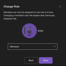
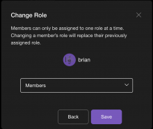
Based on our discussion for using size="profile" in the screen on native, do we also want to do that on web? I personally think the profile-sized avatar looks too big on web, but open to a second option

Screenshot 2023-06-13 at 7.46.50 AM.png (998×992 px, 97 KB)
Screenshot 2023-06-13 at 7.47.23 AM.png (856×1 px, 78 KB)

Jun 13 2023, 8:18 AM

Jun 12 2023

ted added inline comments to D8156: [native] Create a new screen that will show the role change information.
Jun 12 2023, 2:32 PM

Jun 9 2023

ted attached a referenced file: F580531: IMG_1239.jpg.
Jun 9 2023, 1:07 PM
ted added inline comments to D8164: [native] Style RegistrationTerms.
Jun 9 2023, 1:07 PM

Jun 6 2023

ted added a comment to D8068: [native] Refactor the members list to support any variety of role labels.

CC @ted for design (current design doesn't looks great imo. Text seems busy + don't think it looks great left-aligned with avatar on next line. Could we consider alternative approaches? I've seen other messaging apps indicate admin vs. "member" with a crown icon for example. Maybe roles could have icons?)

Jun 6 2023, 1:29 PM

Jun 5 2023

ted added inline comments to D8034: [landing] introduce competitor comparison.
Jun 5 2023, 2:12 PM
ted added inline comments to D7943: [landing] introduce logo svg assets for competitor comparison.
Jun 5 2023, 2:00 PM

May 22 2023

ted added inline comments to D7908: [native] Introduce disable link button.
May 22 2023, 7:05 AM

May 19 2023

ted accepted D7892: [web] Increase `font-size` of `formNotice` in `CommunityCreationModal`.

Nice! Thanks

May 19 2023, 12:05 PM
ted accepted D7889: [native] Add explicit borderColor for non-selected RegistrationTile.
May 19 2023, 12:04 PM
ted accepted D7888: [native] Make panelSecondaryForeground light mode correspond to dark mode.

Cool, thank you for the screen shots to provide context!

May 19 2023, 11:37 AM
ted accepted D7887: [native] Update panelSecondaryForeground to shadesBlack80.

Sounds good, thanks for letting me know! These grays are similar enough that updating the calendar is fine.
May 19 2023, 11:31 AM