Page MenuHomePhabricator

[native] make user profiles accessible from RelationshipListItem
ClosedPublic

Authored by ginsu on Sep 25 2023, 7:04 AM.
Tags
None
Referenced Files
Unknown Object (File)
Sat, Apr 27, 1:06 PM
Unknown Object (File)
Sat, Apr 27, 1:05 PM
Unknown Object (File)
Sat, Apr 27, 1:05 PM
Unknown Object (File)
Sat, Apr 27, 1:05 PM
Unknown Object (File)
Sat, Apr 27, 1:04 PM
Unknown Object (File)
Sat, Apr 27, 12:48 PM
Unknown Object (File)
Mon, Apr 15, 3:59 PM
Unknown Object (File)
Mar 28 2024, 6:38 AM

Details

Summary

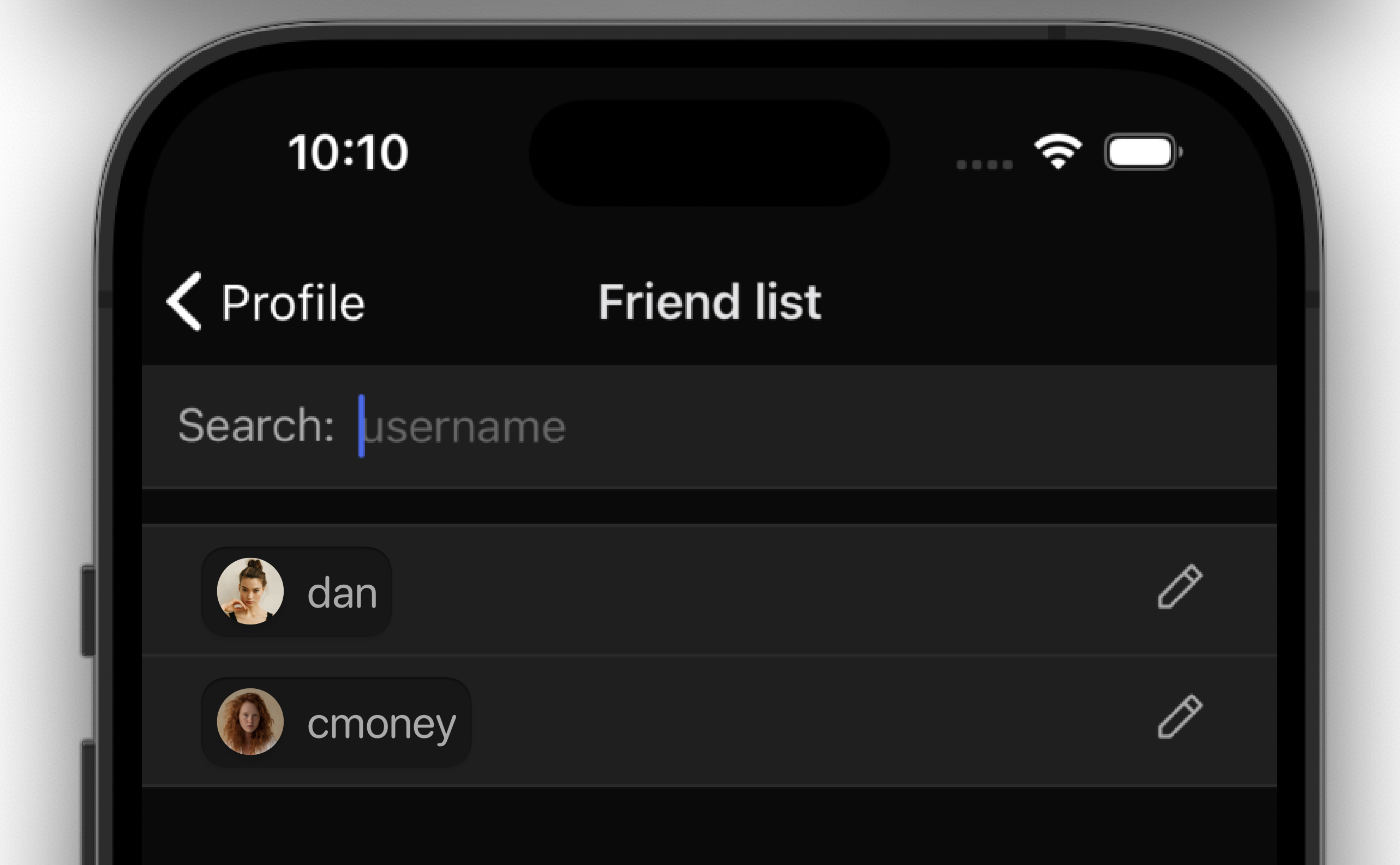
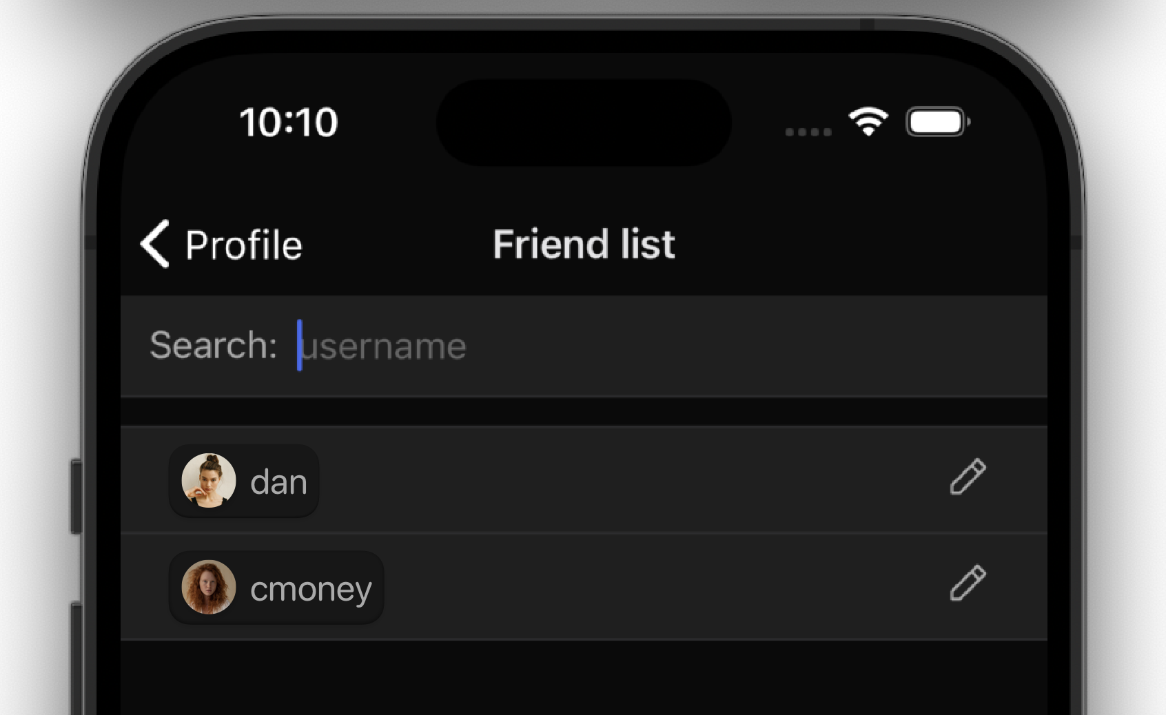
This diff adds a TouchableOpacity to the RelationshipListItem component and navigates to the user profile bottom sheet whenever the onPress is triggered

Depends on D9285

Test Plan

Please see the demo video below

Diff Detail

Repository
rCOMM Comm
Lint
Lint Not Applicable
Unit
Tests Not Applicable

Event Timeline

ginsu edited the test plan for this revision. (Show Details)
ginsu added reviewers: atul, inka.
native/profile/relationship-list-item.react.js
172 ↗(On Diff #31400)

The red background shows the TouchableOpacity:

Screenshot 2023-09-25 at 10.10.09 AM.png (1×1 px, 711 KB)

I think it would be a be a better user experience if we had the entire item be a touchable instead of just the avatar/username

ginsu requested review of this revision.Sep 25 2023, 7:22 AM
atul added a subscriber: ted.
atul added inline comments.
native/profile/relationship-list-item.react.js
172 ↗(On Diff #31400)

What surfaces should be "touchable" is probably something we should consider as part of the Design System (at some point) CC @ashoat @ted

In this particular case, it feels a little weird that we're extending so far to the right, but on the left we go just until the left edge.

I guess this is a new scenario, because previously we were just listing "static" avatars/usernames and left all the interaction to the right-justified icon.

Unsolicited, but if it were up to me I think it'd make sense to give the avatar/username some sort of inset to make it clear that

A. the element is interactive
B. the bounds of the tap target

Something like:

684a67.png (1×2 px, 418 KB)

or

1181e5.png (1×1 px, 309 KB)

This revision is now accepted and ready to land.Sep 26 2023, 12:54 PM
native/profile/relationship-list-item.react.js
172 ↗(On Diff #31400)

I like @atul's idea. Curious for @ted's thoughts, both on Atul's idea and also on how we can include touchable surface / interaction design of touchables in the design system

native/profile/relationship-list-item.react.js
172 ↗(On Diff #31400)

In this particular case, it feels a little weird that we're extending so far to the right, but on the left we go just until the left edge.

I think the touch point can extend more on the left, to where Search starts at the input field above.

@atul @ashoat I think adding touch points to the design system makes perfect sense and can be included for both web and mobile components. Each design system component lives on its own page in Figma, which will also include small documents to specifically point out the interactive touch points. These documents can point out other component rules such as places to use this component, certain rules of how to use this component, etc.

For the concepts you shared, I don't think that adding an inset is necessary to point out that the element is interactive. Adding an inset feels a bit cluttered to the overall list layout. If we do want to use an inset container for the avatar and username, then reducing the separator lines (smaller, more subtle) will help with over-cluttering.

I took a quick look at Discord's username touchpoints in their list. In the video, I am tapping as far right as I can before the two action buttons. The entire width seems tappable except for the two buttons. Not saying we need to do exactly how Discord handles this interaction, I wanted to see how other apps were handling this.

With that, I think the UI is fine how it is, but always open if more people think we should add an inset or interactive indicator. Thank you!

native/profile/relationship-list-item.react.js
172 ↗(On Diff #31400)

For the concepts you shared, I don't think that adding an inset is necessary to point out that the element is interactive. Adding an inset feels a bit cluttered to the overall list layout. If we do want to use an inset container for the avatar and username, then reducing the separator lines (smaller, more subtle) will help with over-cluttering.

I agree with this point, I think especially since we have the edit (pencil) icon to the right it would feel strange if that didn't have an inset/obvious indicator that the icon is touchable but the avatar/username does.

To polish this up, I can make the entire container a touchable or at the very least, also extend the touchable to be touching the left side of this container