Page MenuHomePhabricator

[web] Create a new 'secondary device' screen that will generate the QR code
ClosedPublic

Authored by rohan on Aug 15 2023, 10:25 AM.
Tags
None
Referenced Files
Unknown Object (File)
Fri, Nov 29, 10:10 PM
Unknown Object (File)
Nov 16 2024, 4:09 PM
Unknown Object (File)
Oct 27 2024, 9:00 AM
Unknown Object (File)
Oct 12 2024, 4:10 AM
Unknown Object (File)
Sep 27 2024, 1:58 PM
Unknown Object (File)
Sep 27 2024, 1:58 PM
Unknown Object (File)
Sep 27 2024, 1:58 PM
Unknown Object (File)
Sep 27 2024, 1:58 PM
Subscribers

Details

Summary

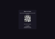
This is the page that will display the QR code, alongside the instructions on where to find the scanner on the native app. These are the designs shown on Figma.

For now, the data encoded in the QR code is just a link, but I will work on supporting 'deep-linking' from scanning with an external camera in ENG-4648. So ultimately that will be changed.

Addresses ENG-4478

Depends on D8818

Test Plan

Please see the video below

Diff Detail

Repository
rCOMM Comm
Lint
Lint Not Applicable
Unit
Tests Not Applicable

Event Timeline

rohan edited the test plan for this revision. (Show Details)
tomek added a reviewer: ted.

This screen doesn't seem to match the design too closely. Is this something agreed with @ted?

Noticed a couple of HTML issues. We don't necessarily have to fix them, because we're already violating a lot of good practices in other places, but it might be beneficial to not introduce new code that has those issues.

web/account/qr-code-login.react.js
12 ↗(On Diff #29918)

According to e.g. https://www.w3.org/WAI/tutorials/page-structure/headings/

Skipping heading ranks can be confusing and should be avoided where possible: Make sure that a <h2> is not followed directly by an <h4>, for example.

or https://www.w3.org/TR/2012/NOTE-WCAG20-TECHS-20120103/G141

Other technologies use other techniques for identifying headers. To facilitate navigation and understanding of overall document structure, authors should use headings that are properly nested (e.g., h1 followed by h2, h2 followed by h2 or h3, h3 followed by h3 or h4, etc.).

it is a bad practice to skip the levels.

23–32 ↗(On Diff #29918)

https://developer.mozilla.org/en-US/docs/Web/HTML/Element/b

However, you should not use <b> for styling text or granting importance. If you wish to create boldface text, you should use the CSS font-weight property. If you wish to indicate an element is of special importance, you should use the <strong> element.

web/theme.css
245–247 ↗(On Diff #29918)

It would be great if we could avoid introducing new colors and instead use already defined or generalize what we have. On the other hand, we can keep it as is and fix it as a part of https://linear.app/comm/issue/ENG-4484/color-families-on-web @ginsu.

This revision is now accepted and ready to land.Aug 16 2023, 3:36 AM
web/account/qr-code-login.react.js
19 ↗(On Diff #29918)

What's the reason behind choosing this level?

Thanks for pointing out the best practices! I'll try to update the code here to follow those

In D8821#260423, @tomek wrote:

This screen doesn't seem to match the design too closely. Is this something agreed with @ted?

Ted didn't make these designs, but I started a discussion in the Comm Design Team channel about some thoughts regarding the screen. The consensus was to not use the 'star' background since we also removed that from landing.

Discussion regarding the background color is still ongoing, but will follow up with @ted and @ginsu to make sure we're on the same page about new colors

web/account/qr-code-login.react.js
19 ↗(On Diff #29918)

Just after doing some research, the level for how much 'error correctness' we need should generally be low since there's no chance of the QR code being destroyed as it's not physical. Ideally if it was a physical copy we'd use a higher level, but in our case it should be completely safe to use a low level

web/account/qr-code-login.react.js
19 ↗(On Diff #29918)

there's no chance of the QR code being destroyed as it's not physical

Not sure it matters, but isn't it possible for QR code to be "destroyed" if the display is shattered or has a crack or something?

web/account/qr-code-login.react.js
19 ↗(On Diff #29918)

Yeah fair point. I did read up that error correctness corresponds with the amount of data that we can encode in it, so I also used low since I'm not so certain how much data we want to store in this for now. It's a super easy change down the line / now if we want it changed regardless

Discussion regarding the background color is still ongoing, but will follow up with @ted and @ginsu to make sure we're on the same page about new colors

Thanks @rohan for the screen recording. Want to double check with @ginsu on how the landing page color system is implemented and see if we can possible use that source?

rohan marked 5 inline comments as done.
  1. Stop skipping headings (use font-size and variables from typography instead)
  2. Use font-weight for bold titles and <strong> for emphasis on certain words in the instructions (instead of <b>)
  3. Use existing colors in theme.css

Screenshot 2023-08-16 at 2.49.41 PM.png (1×3 px, 168 KB)

This addresses existing feedback for now, just going to wait on changing the background color

In D8821#260640, @ted wrote:

Discussion regarding the background color is still ongoing, but will follow up with @ted and @ginsu to make sure we're on the same page about new colors

Thanks @rohan for the screen recording. Want to double check with @ginsu on how the landing page color system is implemented and see if we can possible use that source?

Yeah makes sense!

Remove unused color in theme.css

The square box here doesn't look super on-brand for us... we usually have rounded corners, don't we?

I wonder if we need to take another pass on the design here

The square box here doesn't look super on-brand for us... we usually have rounded corners, don't we?

I wonder if we need to take another pass on the design here

cc @ted for your thoughts

In D8821#261124, @rohan wrote:

The square box here doesn't look super on-brand for us... we usually have rounded corners, don't we?

I wonder if we need to take another pass on the design here

cc @ted for your thoughts

Thanks for the tag! I do agree that rounding the corner of the box will be better here. Our corner radiuses that we have been using is 8px.

Looking at the entire screen now, I think it may be better to contain all the elements in QR scanning step within a modal, instead of having just on the screen. I can take a pass on this.

In D8821#261190, @ted wrote:

Thanks for the tag! I do agree that rounding the corner of the box will be better here. Our corner radiuses that we have been using is 8px.

Looking at the entire screen now, I think it may be better to contain all the elements in QR scanning step within a modal, instead of having just on the screen. I can take a pass on this.

Sounds good, thanks! I'll hold off until a design is ready so I can update this directly before landing

In D8821#261544, @rohan wrote:
In D8821#261190, @ted wrote:

Thanks for the tag! I do agree that rounding the corner of the box will be better here. Our corner radiuses that we have been using is 8px.

Looking at the entire screen now, I think it may be better to contain all the elements in QR scanning step within a modal, instead of having just on the screen. I can take a pass on this.

Sounds good, thanks! I'll hold off until a design is ready so I can update this directly before landing

QR Code Design Pass.png (1×1 px, 28 KB)

Here is a quick design pass that takes the content in the video shown and laid out into a modal. The modal width is the same as the first login modal at 464 px. The text styles also borrow from the same modal as well.

It might also be better to keep the title copy consistent with Sign in to Comm on the modals.

Figma link

  1. Let's find a way to avoid having the "Open the Comm app" part take two lines
  2. I don't love how that line just "trails off" without a period or a colon or something
  3. If we're bolding navigational elements, we should make sure we bold the whole navigational element. "devices" in "Linked devices" appears to not be bolded

Is there a way we can try to make this actually match the style of the main "Sign in to Comm" modal? It frankly looks completely different, in terms of color scheme, navigation, organization, etc. I think we need to do some more work on the design here, but open to landing this diff to unblock Rohan for the time being

Is there a way we can try to make this actually match the style of the main "Sign in to Comm" modal? It frankly looks completely different, in terms of color scheme, navigation, organization, etc. I think we need to do some more work on the design here, but open to landing this diff to unblock Rohan for the time being

I can take another pass at this today. The color scheme is the same as the first "Sign to Comm" modal and the modal dimensions are the same as well. The middle alignment vs left alignment of the copy is what can be consistent between the two. I'll communicate to @rohan if this is the only thing blocking him on the project. Thanks!

Spoke to Ted via Comm. I'll do a second pass on this page (and the one on native) once the designs are ready, but for now I'll land this since it's not visible in production yet

https://linear.app/comm/issue/ENG-4701/follow-up-on-qr-code-page-screen-designs

This revision was landed with ongoing or failed builds.Aug 22 2023, 8:19 AM
This revision was automatically updated to reflect the committed changes.