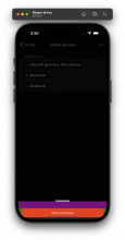
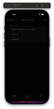
Depends on D13038
Details
Diff Detail
- Repository
- rCOMM Comm
- Lint
Lint Not Applicable - Unit
Tests Not Applicable
Event Timeline
Besides that one thing, device removal logic looks good
| native/profile/linked-devices-bottom-sheet.react.js | ||
|---|---|---|
| 94 ↗ | (On Diff #43944) | We should broadcast the update also to own devices, except the one being removed: |
I'm curious to see what this looks like. Given this is primarily a UI diff, can you share a screen capture video of the flow? (Easy to record with the built-in QuickTime Player app on macOS)
Requesting changes primarily so I can see what it looks before accepting. Sorry for the churn
| native/profile/linked-devices-bottom-sheet.react.js | ||
|---|---|---|
| 89–96 ↗ | (On Diff #45266) | Can these be done in parallel, or do we need to wait on the first before starting the second? |
| 109 ↗ | (On Diff #45266) | We shouldn't capitalize the second word like this |
Feedback: Fixed capitalizing, parallelized sending messages. Attached video to the test plan
| native/profile/linked-devices-bottom-sheet.react.js | ||
|---|---|---|
| 89–96 ↗ | (On Diff #45266) | Good question. At first I was certain that it needs to be done sequentially, but realized it doesn't matter, the device list is already updated and these both are just sending Tunnelbroker messages. It doesn't matter who receives it first (peers or the logged out device). |
Thanks for sharing the video! Unfortunately, the button appears over the home pill. Can you make sure that the button appears above the home pill? As an example, take a look at the use of useSafeAreaInsets in KeyserverSelectionBottomSheet
The useSafeAreaInsets is already used here. The issue turned out to be missing padding. The Keyserver bottom sheet is more complex and it was calculated differently there.
This solution is ringing alarm bells. It feels like a hack... seems like you just added some padding to push the content up, but it's unclear to me why this padding needs to be added (what is it making up for?)
Unfortunately I won't be able to accept the diff without a deeper explanation. I feel compelled to have to check out your code myself to investigate, which is not a good pattern for a reviewer, and is made extra complicated here because you didn't rebase the final diff in the stack after this update...
I looked at this more closely and indeed it appears that the prior revision is a hack.
The core issue here is a problem in native/bottom-sheet/bottom-sheet.react.js. Here is what I learned:
- First, note that we override handleComponent. To see what part that renders, I used this patch to make it appear purple:
- Next, I observed that we set snapPoints based on the value of contentHeight. To see if this includes handleComponent, I tested forcing snapPoints={[1]}. We can see that part of the handle component is hidden:
- From this we can conclude that contentHeight needs to include some offset to make up for part of the height of the handle component. I did some testing of snapPoints values and found that we need exactly 24 pixels here.
- From looking at the BottomSheetHandle component, I suspect this comes from (gap height) + (knobHandleContainer marginTop) + (knobHandle height), which adds up to 24
I'll put up a stack to fix this.
I put up a stack of diffs here: D13871
Please rebase on those diffs and remove the hardcoded paddingBottom: 24 hack


