Page MenuHomePhabricator

[landing] introduce feature modal component
ClosedPublic

Authored by ginsu on May 29 2023, 10:54 PM.
Tags
None
Referenced Files
F3388682: D8025.diff
Fri, Nov 29, 3:35 PM
Unknown Object (File)
Tue, Nov 26, 12:45 PM
Unknown Object (File)
Sun, Nov 17, 2:19 AM
Unknown Object (File)
Sun, Nov 17, 1:36 AM
Unknown Object (File)
Sun, Nov 17, 1:36 AM
Unknown Object (File)
Sun, Nov 17, 1:35 AM
Unknown Object (File)
Sun, Nov 17, 1:35 AM
Unknown Object (File)
Sun, Nov 17, 1:35 AM

Details

Summary

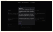
This diff introduces the feature modal that will pop up whenever a user clicks on a feature comparison card. This diff just introduces the structure and style of the modal and subsequent diffs will put everything together. The ui for the modal did deviate a bit from what is on the Figma design; however, given the structure of the competitor data copy, I thought it was better to have some separation between the texts and to show the company logos, instead of just one giant paragraph (cc @ted). Here is a screenshot of the figma for reference:

Screenshot 2023-05-30 at 2.20.51 AM.png (998×1 px, 239 KB)

Depends on D8537

Test Plan

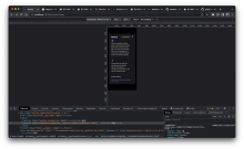
Please watch the demo video to see how the feature modal looks and behaves:

General behavior:

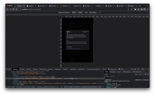
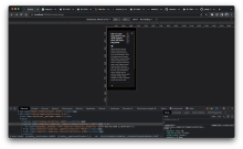
Responsiveness:

Mobile:

Screenshot 2023-05-30 at 2.24.17 AM.png (1×3 px, 1 MB)

Tablet:

Screenshot 2023-05-30 at 2.24.13 AM.png (1×3 px, 1 MB)

Diff Detail

Repository
rCOMM Comm
Lint
No Lint Coverage
Unit
No Test Coverage

Event Timeline

make prop types read only

make links open a new tab

ginsu edited the test plan for this revision. (Show Details)
ginsu added reviewers: atul, kamil.
ginsu added a subscriber: ted.
landing/competitor-feature.css
12–13 ↗(On Diff #27251)

Not a super related change, but as I was testing the responsiveness of the feature modal, I tested what would happen if I had a very long feature name. There was some weirdness with the UI; however, these two additions fixes that and now the modal matches the design perfectly:

Design:

Screenshot 2023-05-30 at 2.21.15 AM.png (1×772 px, 167 KB)

Before:

Screenshot 2023-05-30 at 2.28.22 AM.png (1×3 px, 1 MB)

After:

Screenshot 2023-05-30 at 2.28.50 AM.png (1×3 px, 1 MB)

12–13 ↗(On Diff #27247)

As I was doing more tests about the responsiveness of the modal

atul requested changes to this revision.May 30 2023, 7:27 AM

Looks good, can we avoid hard coding hex value being passed to ModalOverlay backgroundColor?

landing/feature-modal.react.js
52 ↗(On Diff #27251)

Can we avoid hard coding hex value here?

55–61 ↗(On Diff #27251)

Seems like we could just pass feature as prop to CompetitorFeature and let it handle accessing each field

This revision now requires changes to proceed.May 30 2023, 7:27 AM
landing/feature-modal.react.js
55–61 ↗(On Diff #27251)

I thought about this too, but then CompetitorFeature will need extra logic to determine if we should access the competitorDescriptionShort field or the competitorDescriptionLong for the competitorDescription and the same thing for commDescription. I thought that it would be more elegant to pass down the props this way, so that we can avoid that extra logic but let me know if you still disagree

ginsu edited the test plan for this revision. (Show Details)

address comments

landing/global.css
46

This color was missing from the landing page color design system. I updated the design system to include this color so that everything is still in sync

ashoat added inline comments.
landing/global.css
46

I believe @kuba has been implementing two modal overlay colors recently on web. Would be good to make sure our practices are in sync between web / landing. On web, we have this:

--modal-overlay-background-90: rgba(0, 0, 0, 0.9);
--modal-overlay-background-80: rgba(0, 0, 0, 0.8);

Not sure why we're using black-with-opacity on web, versus almost-black-with-opacity on landing. Wonder if we could replace #010101bf with one of the colors we're using on web, but I guess it's not super important given that landing has its own distinct design system.

Not sure why we're using black-with-opacity on web, versus almost-black-with-opacity on landing. Wonder if we could replace #010101bf with one of the colors we're using on web, but I guess it's not super important given that landing has its own distinct design system.

#010101bf was the value @ted put in the Figma, but I will double check with him if he wants to keep the modal overlay colors in sync or have them still be distinct when he gets back later this week. Regardless of what he says, this should be a quick/easy update

Thanks for updating, looks good

landing/feature-modal.react.js
55–61 ↗(On Diff #27251)

Personally would prefer to "push down" the complexity, but it's subjective/not a huge deal so what you currently have is fine

This revision is now accepted and ready to land.May 30 2023, 9:01 AM
landing/global.css
46

cc @ted

update --modal-overlay color value to match a value on web (this was the closet color to the original #010101bf)

This revision was automatically updated to reflect the committed changes.