Page MenuHomePhabricator

[web] Add an option to edit and delete select roles
ClosedPublic

Authored by rohan on Jul 25 2023, 8:09 AM.
Tags
None
Referenced Files
Unknown Object (File)
Mon, Nov 11, 6:12 AM
Unknown Object (File)
Sun, Nov 10, 12:39 AM
Unknown Object (File)
Sat, Nov 9, 11:31 PM
Unknown Object (File)
Sat, Nov 9, 8:27 PM
Unknown Object (File)
Sat, Nov 9, 8:24 PM
Unknown Object (File)
Sat, Nov 9, 8:09 PM
Unknown Object (File)
Sat, Nov 9, 7:41 PM
Unknown Object (File)
Sat, Nov 9, 4:18 PM

Details

Summary

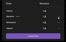
This diff introduces the dropdown select options to edit a role and delete a role. The implementation of editing roles will come in the next diff, and the implementation of deleting roles will come in the following one. Here, all roles besides Admins can be edited (we don't have a better way to check for Admins than by name for now, once ENG-4155 is taken on, that will be the better way). Similarly, all roles besides Members and Admins can be deleted.

Part of ENG-4429 and ENG-4431.

Depends on D8597
Test Plan

Confirmed that the options appear for each role as expected

Diff Detail

Repository
rCOMM Comm
Lint
No Lint Coverage
Unit
No Test Coverage

Event Timeline

rohan edited the test plan for this revision. (Show Details)
Harbormaster returned this revision to the author for changes because remote builds failed.Jul 25 2023, 8:12 AM
Harbormaster failed remote builds in B21187: Diff 29022!
rohan requested review of this revision.Jul 25 2023, 8:32 AM
atul requested changes to this revision.Jul 26 2023, 3:12 PM
atul added a subscriber: ted.

Left a couple comments inline. The two that should be addressed before this diff can be accepted:

  1. Move isDeletableRole and isEditableRole logic to role-utils.
  2. Merge items and roleMenuItems into a single React.useMemo.

The below are just loose thoughts regarding design/copy that aren't relevant to code review.


Unsolicited, but in terms of design:

  1. I think we typically use vertical ellipses instead of horizontal ones for dropdown menus.
  2. I think it makes sense to show the pencil icon (or maybe settings cog) directly instead of having the indirection of dropdown. We can display "Edit role" on hover like we do for InlineEngagement to clarify what the button is for:

95985d.png (256×442 px, 18 KB)

  1. I think we can remove the "Delete role" button from the dropdown altogether. I don't think it necessarily makes sense to be in a top-level dropdown like this? IMO it can appear as part of whatever EditRoleModal hitting the pencil icon will take the user to. Don't really imagine a scenario where a user is quickly going through roles and deleting them? Don't think requiring indirection to "Edit role" modal to delete role hurts.

Feel free to ignore the above wrt code review, just jotting down thoughts. (cc @ashoat, @ginsu, @ted)


Unsolicited, but in terms of copy:

There's a lot of text at the top of the modal.

When people join the community, they are automatically assigned the Members role.

I think we could eliminate this sentence if we put a "Default" pill or badge next to the Members role. Something—very loosely—like:

3eabd9.png (1×1 px, 103 KB)

Communities must always have the Admins and Members role.

I think it would make more sense to explain this requirement as/when a user attempts to edit/remove the Admins/Members role.

We could disable/gray out the icon and explain the requirement on hover. Something like:

4e4d5e.png (156×844 px, 29 KB)

Feel free to ignore the above wrt code review, just jotting down thoughts. (cc @ashoat)

web/components/menu.react.js
9–14 ↗(On Diff #29076)

Really don't love how specific these variants are... something we should improve w/ the design system

(cc @ashoat, @ginsu, @ted)

web/roles/role-actions-menu.react.js
22–27 ↗(On Diff #29076)

Could do something like:

const defaultRoleID = _.findKey(roles, 'isDefault');
const existingRoleID = _.findKey(roles, { name: roleName });

with Lodash, but I think as a team we generally avoid Lodash unless there's a significant benefit.. so probably not here.

28–31 ↗(On Diff #29076)

Seems like this logic should live in role-utils rather than the RolesActionsMenu component.

33–34 ↗(On Diff #29076)

Could annotate this with a TODO comment or something

36–71 ↗(On Diff #29076)

Rather than creating an array of props for MenuItem component and then mapping them in, it seems like we can just create the <MenuItems> directly in items?

If we did something like:

const menuItems = React.useMemo(() => {
  const availableOptions = [];

  if (isEditableRole) {
    availableOptions.push(
      <MenuItem
        key='Edit role'
        text='Edit role'
        icon='edit-1'
        onClick={openEditRoleModal}
        dangerous={false}
      />
    );
  }

  if (isDeletableRole) {
    availableOptions.push(
      <MenuItem
        key='Delete role'
        text='Delete role'
        icon='cross-circle'
        onClick={openDeleteRoleModal}
        dangerous={true}
      />
    );
  }

  return availableOptions;
}, [isDeletableRole, isEditableRole, openDeleteRoleModal, openEditRoleModal]);

we could skip the intermediate step of "preparing the props."

This revision now requires changes to proceed.Jul 26 2023, 3:12 PM
In D8623#254430, @atul wrote:

Unsolicited, but in terms of design:

  1. I think we typically use vertical ellipses instead of horizontal ones for dropdown menus.
  2. I think it makes sense to show the pencil icon (or maybe settings cog) directly instead of having the indirection of dropdown. We can display "Edit role" on hover like we do for InlineEngagement to clarify what the button is for:

95985d.png (256×442 px, 18 KB)

  1. I think we can remove the "Delete role" button from the dropdown altogether. I don't think it necessarily makes sense to be in a top-level dropdown like this? IMO it can appear as part of whatever EditRoleModal hitting the pencil icon will take the user to. Don't really imagine a scenario where a user is quickly going through roles and deleting them? Don't think requiring indirection to "Edit role" modal to delete role hurts.

Feel free to ignore the above wrt code review, just jotting down thoughts. (cc @ashoat, @ginsu, @ted)

Just my opinions / thoughts, I think you bring up some valid suggestions so definitely happy to hear from others to come to a consensus:

  1. I think so as well after a quick look at the community drawer and the thread menu dropdown. Should just be an easy icon change to menu-vertical (can't remember the exact name right now)
  2. Honestly I prefer the two separate options up front as opposed to having to go into the edit roles screen to delete a role, and personally think it looks cleaner, but happy to get thoughts here
  3. Same as 2)

Unsolicited, but in terms of copy:

There's a lot of text at the top of the modal.

When people join the community, they are automatically assigned the Members role.

I think we could eliminate this sentence if we put a "Default" pill or badge next to the Members role. Something—very loosely—like:

3eabd9.png (1×1 px, 103 KB)

I like this idea! Would definitely prefer to put it to the backlog / for a later cycle though

Communities must always have the Admins and Members role.

I think it would make more sense to explain this requirement as/when a user attempts to edit/remove the Admins/Members role.

We could disable/gray out the icon and explain the requirement on hover. Something like:

4e4d5e.png (156×844 px, 29 KB)

Feel free to ignore the above wrt code review, just jotting down thoughts. (cc @ashoat)

Open to either, my personal thoughts is since it's a modal component, having another tooltip overlay may seem a bit 'cluttered' and prefer the current designs, but happy to get more thoughts here as well.

(I appreciate the in-depth design / copy suggestions here!)

web/components/menu.react.js
9–14 ↗(On Diff #29076)

Definitely agree

Regarding @atul's design feedback, I mostly agree with all of it. I'm not sure if it's too late to revise these designs, though... Ted is currently out, and we're trying to land this stack before the end of the month.

Regarding @atul's design feedback, I mostly agree with all of it. I'm not sure if it's too late to revise these designs, though... Ted is currently out, and we're trying to land this stack before the end of the month.

Two options seem doable, I could either (once the last few diffs are accepted), hold off on landing while prioritizing the designs.

The other option is to create a follow up task on Linear, and go through once everything is landed and update the designs during the first few days after. They should all be just product-side so landing then doing the designs shouldn’t cause any problems.

Open to either though, it’s just a question of whether we want to prioritize landing first or updating the designs

Open to either though, it’s just a question of whether we want to prioritize landing first or updating the designs

I think we should land as is and do a follow-up design pass (if necessary).

Thanks for going through and addressing feedback!

lib/utils/role-utils.js
61–76

Personally would prefer this broken down into two separate functions (and maybe composed together in a hook like this?), but it's totally fine to land as is.

web/components/menu.css
50

Is div.menuActionListRoleActions positioned absolutely implicitly?

Would it make more sense to use margin-top or padding-top?

This revision is now accepted and ready to land.Jul 28 2023, 11:57 AM
This revision was landed with ongoing or failed builds.Jul 31 2023, 6:15 PM
This revision was automatically updated to reflect the committed changes.