Page MenuHomePhabricator

[native] Add a header componnent with a search bar
ClosedPublic

Authored by inka on May 8 2023, 4:24 AM.
Tags
None
Referenced Files
Unknown Object (File)
Sun, Nov 17, 3:50 AM
Unknown Object (File)
Sun, Nov 17, 3:50 AM
Unknown Object (File)
Sun, Nov 17, 3:50 AM
Unknown Object (File)
Sun, Nov 17, 3:50 AM
Unknown Object (File)
Sun, Nov 17, 3:50 AM
Unknown Object (File)
Sun, Nov 17, 3:50 AM
Unknown Object (File)
Sun, Nov 17, 3:50 AM
Unknown Object (File)
Sun, Nov 17, 3:47 AM

Details

Summary

issue: https://linear.app/comm/issue/ENG-3405/create-a-header-with-the-search-input-field
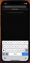
This will be used in the message search screen. Some design changes were discussed by me and Ted, and noted on Linear.

iOS:

Screenshot 2023-05-10 at 14.51.58.png (1×684 px, 289 KB)

Android:
Screenshot_2023-05-10-14-49-46-47_bc14914796be02770da2fb3baf3b2995.jpg (2×1 px, 86 KB)

The search button:
Android:

android-search-button.jpg (2×1 px, 198 KB)

iOS (my simulator for some reason refuses to show me the keyboard in english, but "szukaj" is "search" in polish):
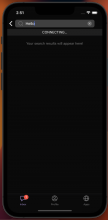
Screenshot 2023-05-10 at 15.23.30.png (1×684 px, 337 KB)

Test Plan

Tested with next diffs - tested that the query from the search context is set when the "enter" is pressed, and is not being set on every character change. Tested that the cancel button appears only when the input is not empty. Tested that pressing the cancel button clears the query and the input.

Diff Detail

Repository
rCOMM Comm
Branch
inka/search_backend
Lint
No Lint Coverage
Unit
No Test Coverage

Event Timeline

Fix text colour in light mode

inka requested review of this revision.May 8 2023, 4:48 AM

Does it look the same on Android?

  • Agree it would be good to see Android too, given that ReactNav can look different on iOS on Android
  • Hard to review this without knowing the test plan (later diffs are not here yet, but I guess they will be coming soon)
  • It looks like the border radius is too rounded, compared to the Figma designs

Match the new border radius

Make the "enter" button a "search" button

ashoat requested changes to this revision.May 11 2023, 3:49 AM
ashoat added inline comments.
native/themes/colors.js
98–99 ↗(On Diff #26343)

Adding new colors here should be extremely, extremely rare. You should do this if you have a very very strong reason for doing so. Have you consulted with Ted? Has he indicated that we need a whole new category of colors for your work? Did you try finding a way to get one of the existing families of colors (eg. panel or modal) to work?

This revision now requires changes to proceed.May 11 2023, 3:50 AM
native/themes/colors.js
98–99 ↗(On Diff #26343)

These are the colours used in the designs here, but I have not asked Ted if the colours in the designs should be changed to match other places if this is what you mean.
Should I do that? Is this what you meant?

If you mean why I created new variables, and not the above - I followed the algorithm of adding colours we agreed on in one of my linear issues:

  1. Check the colour in figma
  2. See if this colour already exists in colors.js
  3. if the name of the variable makes sense for my use case, use that variable
  4. if the name doesn't make sense in my use case, create a new variable with this value and for lightmode use the same lightmode colour as the already existing variable
native/themes/colors.js
98–99 ↗(On Diff #26343)

That algorithm generally makes sense, but I'd like to modify it slightly – for step 4, rather than introducing a separate instance, I wonder if we should consider renaming the original instance.

Alternately, we could consider doing something more like on web. There we have two layers – the names of colors (eg. --shades-black-90) and then separately functional names (eg. --btn-bg-outline) that point to the former.

This way I think we can avoid my fear of new colors being introduced. The more colors we have here, the harder it will be for us to get back to having a consistent design system.

This is probably something we should talk about on a higher level with Ted as well.

native/themes/colors.js
98–99 ↗(On Diff #26343)

Renaming the original instance might make sense, but could also cause more issues when introducing the proper design system. For example, it isn't a good idea to rename a border color to text color. From my point of view, it would be easier to migrate to e.g. web approach when we use new color variable for each new color - we can then easily merge them and avoid cases where colors matched just by accident.

So my opinion is that we shouldn't spend too much time now thinking about which colors should get renamed - we can save a lot of time avoiding this and in the result increase the number of colors only a little. Also, I imagine that what we currently have in this file won't be too significant when migrating to the new scheme - we would probably go component-by-component and assign the color, because some colors don't match our color selection (weren't updated when new colors were introduced).

native/themes/colors.js
98–99 ↗(On Diff #26343)

From my point of view, it would be easier to migrate to e.g. web approach when we use new color variable for each new color - we can then easily merge them and avoid cases where colors matched just by accident.

I think this is a good plan. Is there a way we can start doing that now?

Separately, I'm still a little concerned about the addition of a new "category" of colors (the search colors)... do we really feel like we can't use the existing "categories" (panel or modal) here? This is more of a question for Ted, but it feels like we need to do better at maintaining a consistent design system... if every page / feature has its own "category", I think things will get very messy very quickly

native/themes/colors.js
98–99 ↗(On Diff #26343)

From my point of view, it would be easier to migrate to e.g. web approach when we use new color variable for each new color - we can then easily merge them and avoid cases where colors matched just by accident.

I think this is a good plan. Is there a way we can start doing that now?

I just put up D7820 for this. We can rebase this on that, but it appears that one of the colors introduced here (#999999) is not in the design system.

Separately, I still feel that it doesn't make sense to have a separate "family" of colors for search, especially if we're going to mix in colors for other families (as we do later in the stack, where I believe the panel family is used at times).

If we think this is a "panel" use case, I'd argue we should try to use panel colors throughout, and introduce new panel colors if necessary.

native/themes/colors.js
98–99 ↗(On Diff #26343)

D7820 improves a lot! Regarding introducing a new family, for search, it might make some sense as search component might be displayed in different contexts in the future. Using panel colors also makes some sense - I don't have a strong opinion.

Rebase, use new colors system

Thanks, this makes sense to me. cc @ted

Please address inline comment before landing!

native/search/search-bar.react.js
84 ↗(On Diff #26495)

We're still mixing color families here – can you replace this with something from the panel family? It looks like panelForegroundLabel is the same

This revision is now accepted and ready to land.May 16 2023, 5:48 AM