Page MenuHomePhabricator

[landing] introduce mobile nav compoment
ClosedPublic

Authored by ginsu on May 9 2023, 6:45 AM.
Tags
None
Referenced Files
Unknown Object (File)
Sat, Mar 30, 2:38 AM
Unknown Object (File)
Wed, Mar 27, 11:53 PM
Unknown Object (File)
Mar 5 2024, 8:27 AM
Unknown Object (File)
Mar 3 2024, 4:23 AM
Unknown Object (File)
Mar 2 2024, 7:56 PM
Unknown Object (File)
Feb 10 2024, 2:40 PM
Unknown Object (File)
Feb 10 2024, 2:40 PM
Unknown Object (File)
Feb 10 2024, 2:37 PM
Subscribers

Details

Summary

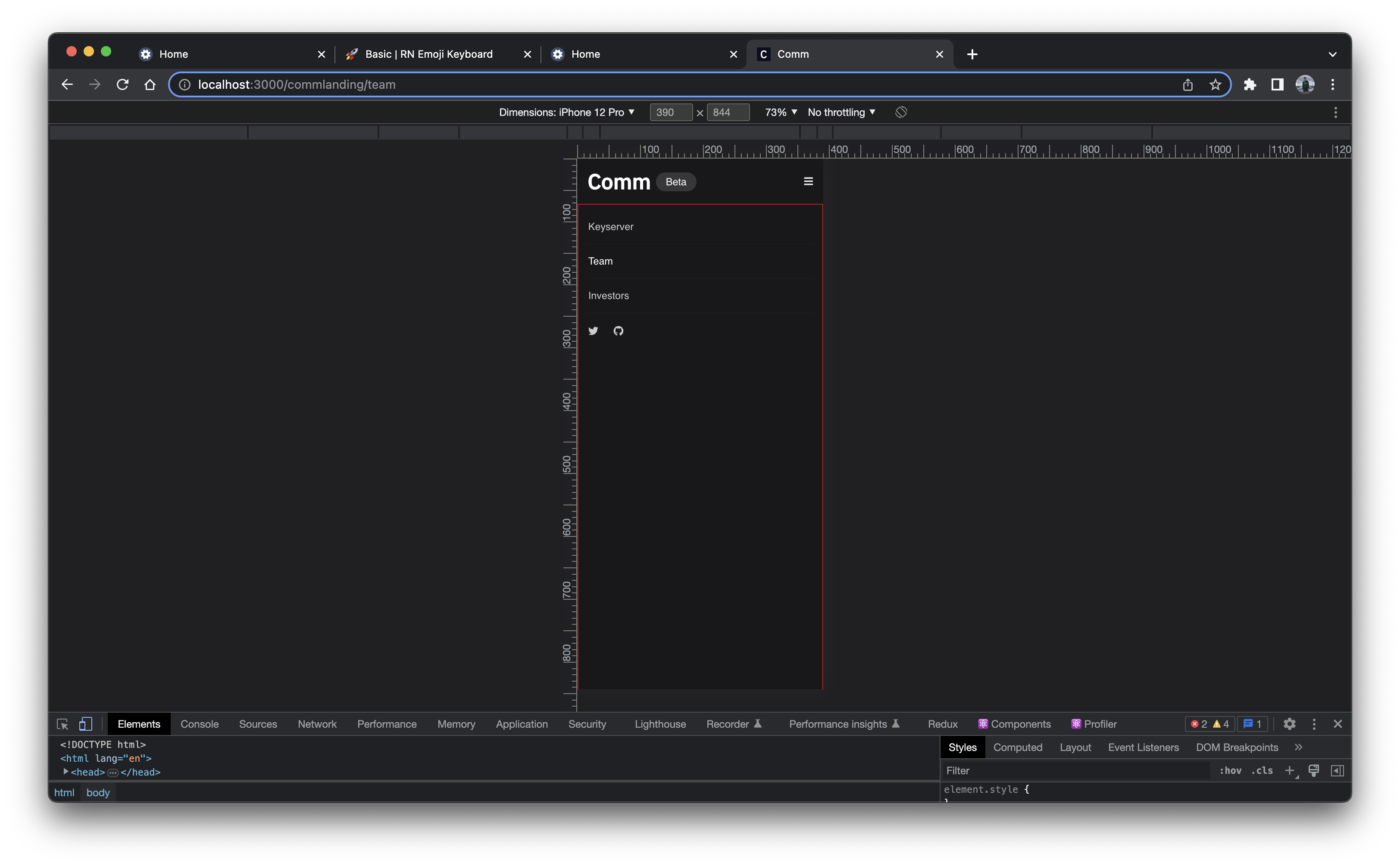
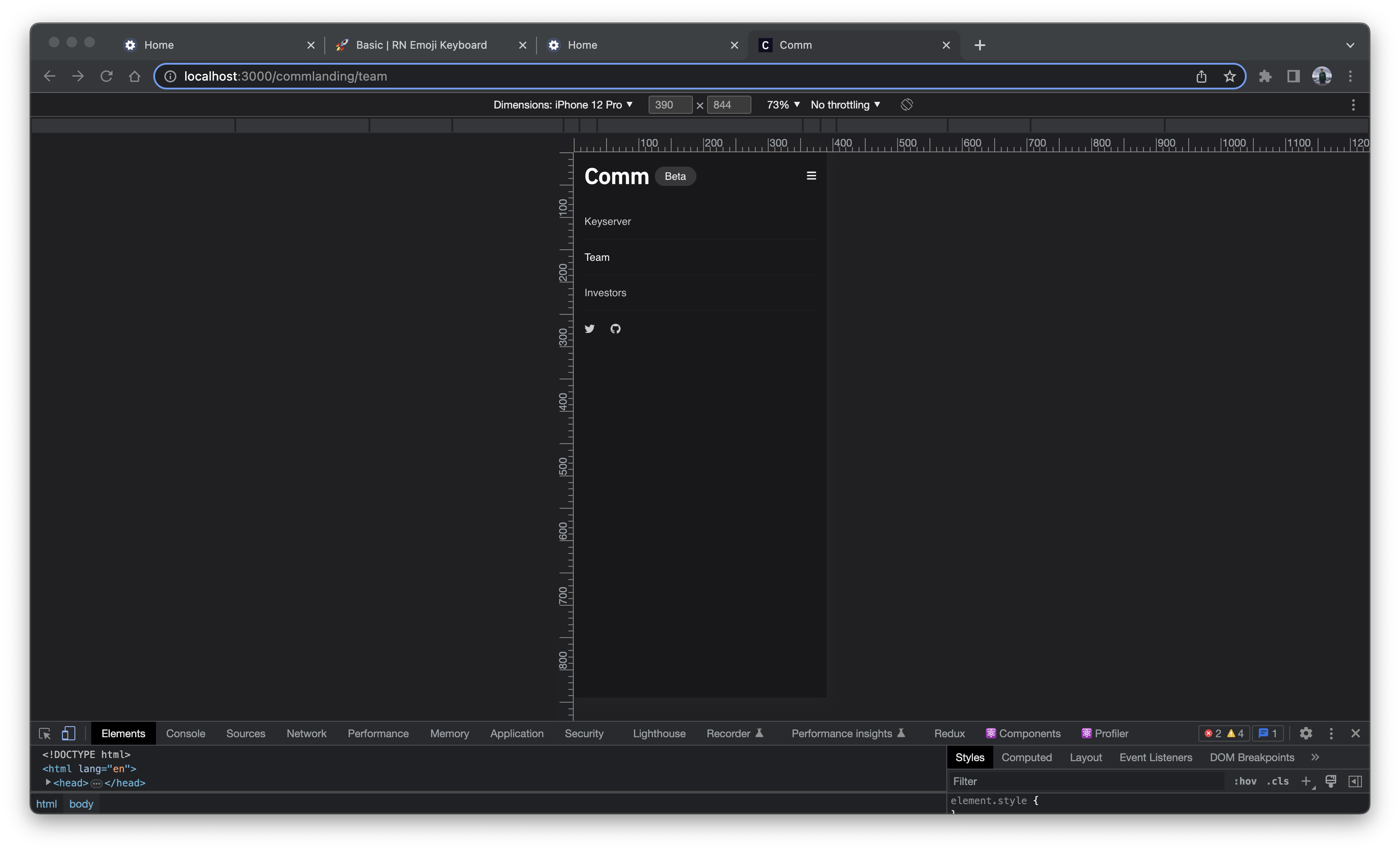
This diff introduces the mobile nav component and the styles to go with it. This diff is just the component and the next couple of diffs will introduce the animation for it and integration of it into the landing page.

Figma

Linear Task: https://linear.app/comm/issue/ENG-3424/update-the-nav-header

Depends on D7759

Test Plan

Here are some screenshots to show what the mobile nav component will look like when it is active (the red border is only in the screenshot just to make it easier for reviewers to see what this component is)

Screenshot 2023-05-09 at 2.11.55 PM.png (2×3 px, 793 KB)

Screenshot 2023-05-09 at 2.12.02 PM.png (1×3 px, 608 KB)

Diff Detail

Repository
rCOMM Comm
Lint
Lint Not Applicable
Unit
Tests Not Applicable

Event Timeline

ginsu edited the test plan for this revision. (Show Details)
ginsu added reviewers: atul, kamil.
ginsu edited the summary of this revision. (Show Details)
landing/mobile-nav.css
15 ↗(On Diff #26303)

The reason for this is style is to prevent this highlight from happening when a user using a mobile device tries to navigate to another page. On a desktop/laptop this would not happen since a user would be clicking and not tapping

The only mobile browser where this style is not compatible is firefox for android. I figured the amount of people who actually use this browser is quite minimal so it would not be risky to add (the only risk is that firefox for android users would briefly see the tap highlight color) and this style would fix the tap highlight color for every other mobile browser

ginsu requested review of this revision.May 9 2023, 7:09 AM

<MobileNav> component looks clean!

landing/mobile-nav.css
3 ↗(On Diff #26303)

Wouldn't -100vh achieve the same thing since that's the height of the mobileNav?

(This is probably fine, just want to make sure I understand how things work here.)

15 ↗(On Diff #26303)

MDN has a scary notice saying that this CSS property is "Non-standard":

8ba613.png (272×1 px, 66 KB)

Open to leaving this in since it looks like "in practice" this is implemented as expected in all browsers except Firefox on Android, but still hesitant about introducing browser-specific styles... wonder if there's a different way to achieve the same effect?

39 ↗(On Diff #26303)

Same feedback as above

This revision is now accepted and ready to land.May 15 2023, 12:55 PM
landing/mobile-nav.css
3 ↗(On Diff #26303)

Since we are setting the top: 0 value in nav.activeMobileNav class in D7781 to be right underneath the header we do need to set the top here to be top: -110vh so that we prevent this situation (this is when top: -100vh):

Screenshot 2023-05-16 at 2.04.52 PM.png (2×1 px, 648 KB)

Probably should have wrote an inline comment initially to make that more clear

15 ↗(On Diff #26303)

I did spend a lot of time searching and looking for alternate ways to achieve the same thing; however, I was still getting that highlight box shown in the video above. I know this is not the "ideal" solution since we are using browser-specific style, but I do think it is the lesser of two evils where having that highlight when a user taps on a tab is worse than having some browser-specific styles.

Again I just want to reiterate that the only risk to using this style is that this does not work for Firefox for android users (which I don't expect is a majority of people), and the benefits here is that every other mobile browser won't have this weird tap highlight color

This revision was automatically updated to reflect the committed changes.