Page MenuHomePhabricator

[landing] introduce new header elements to header component
ClosedPublic

Authored by ginsu on May 16 2023, 6:04 AM.
Tags
None
Referenced Files
Unknown Object (File)
Wed, Mar 27, 11:53 PM
Unknown Object (File)
Feb 10 2024, 4:59 PM
Unknown Object (File)
Feb 10 2024, 4:59 PM
Unknown Object (File)
Feb 10 2024, 4:58 PM
Unknown Object (File)
Feb 10 2024, 4:58 PM
Unknown Object (File)
Feb 10 2024, 4:58 PM
Unknown Object (File)
Feb 10 2024, 4:38 PM
Unknown Object (File)
Feb 10 2024, 3:49 PM

Details

Summary

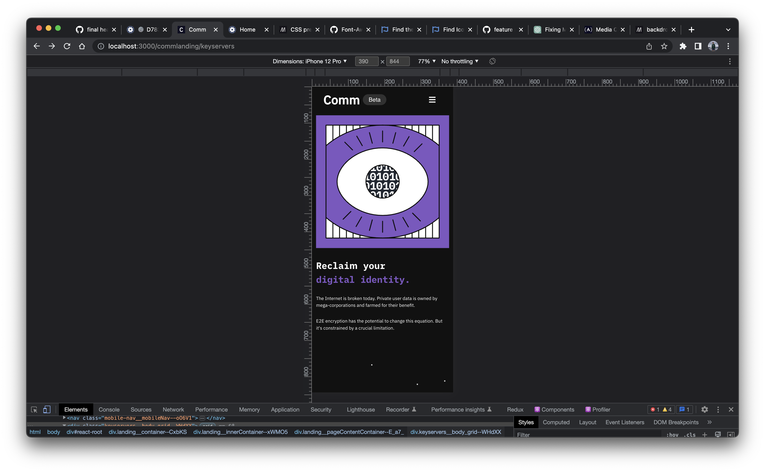
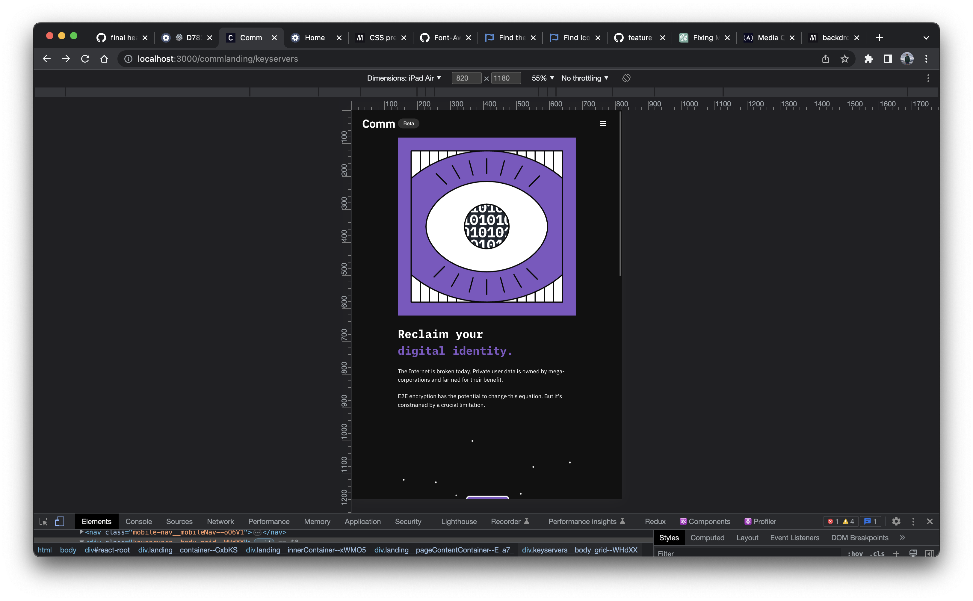
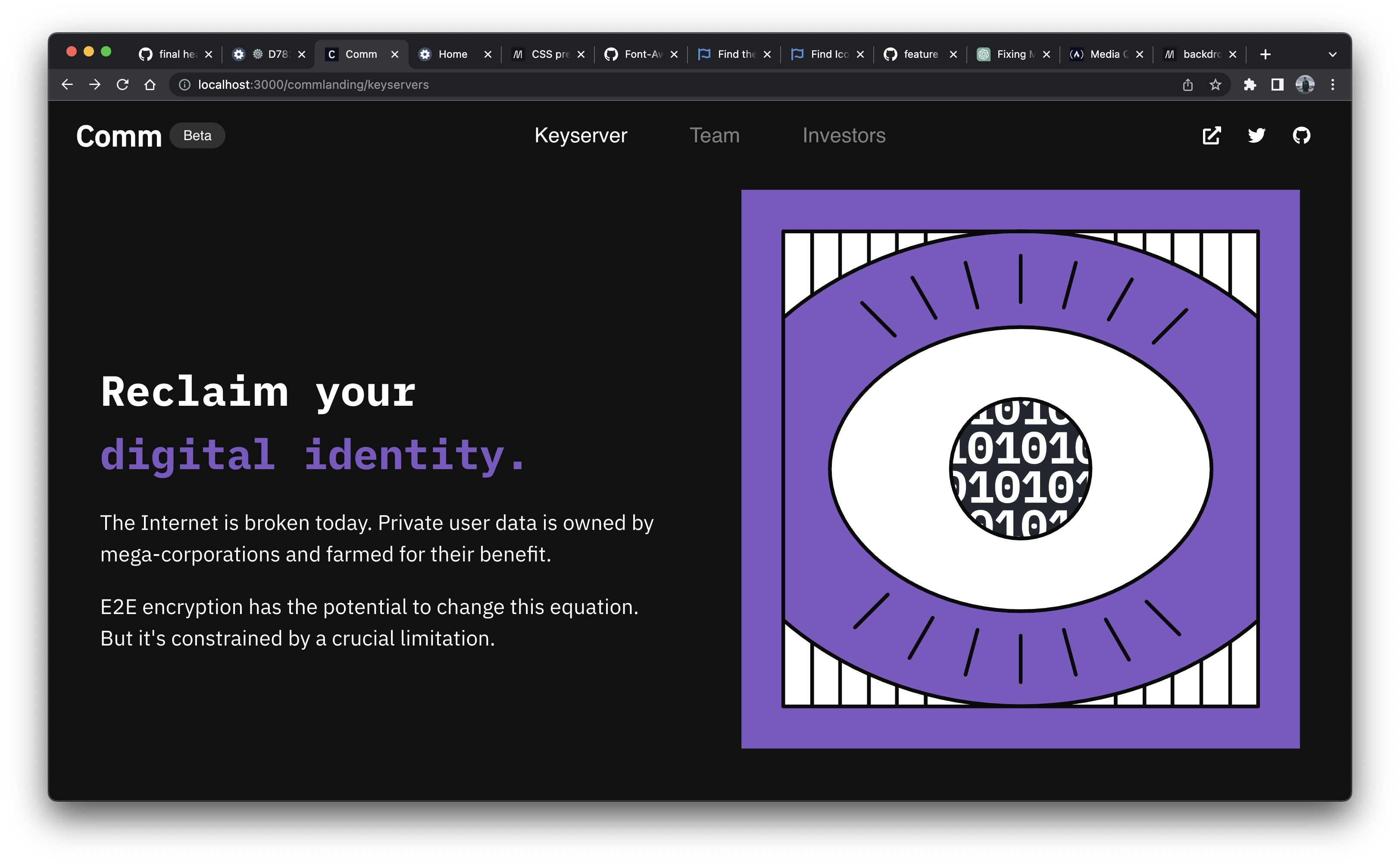
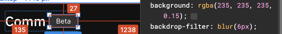
This diff is the second part to updating the Header component to match the redesigns. The foucs of this diff is to introduce and layout the new elements needed for the header redesign. The new elements include:

  1. Beta Badge
  2. Team and Investors page nav replacing the App page nav

In this diff I also updated any typography/colors to use our design system created by Ted. I did not update the Github/Twitter colors, because those are one off instances that probably won't ever need to change, but if we want to create variables for them, I can do that.

Depends on D7835

Test Plan

Please watch the demo video to see how the new Header component looks and behaves

iPhone:

Screenshot 2023-05-18 at 10.05.19 PM.png (2×3 px, 935 KB)

iPad:

Screenshot 2023-05-18 at 10.22.05 PM.png (2×3 px, 926 KB)

Desktop:

Screenshot 2023-05-18 at 10.22.52 PM.png (2×3 px, 864 KB)

Responsive:

Diff Detail

Repository
rCOMM Comm
Lint
Lint Not Applicable
Unit
Tests Not Applicable

Event Timeline

update github icon background color

ginsu edited the test plan for this revision. (Show Details)
ginsu added reviewers: atul, kamil.
landing/header.css
27 ↗(On Diff #26538)

Saw @atul do this in D7764 with the hr border-top style, so I think having this should be fine too

ginsu requested review of this revision.May 16 2023, 6:27 AM

I don't want to request changes and block this diff, but very extremely strongly feel that we should use the existing and well understood h1 -> h6 system of categorizing text styles instead of rolling our own that "acts in parallel."

Can we please revisit that decision, it really doesn't make any sense to me at all...

landing/header.css
28 ↗(On Diff #26538)

Will there be elements behind the betaBadge to be blurred?

104 ↗(On Diff #26538)

Is 816px a "standard" breakpoint?

landing/header.react.js
18 ↗(On Diff #26538)

Eh this is kind of weird. It would make more sense to define h2 in some stylesheet and then apply logoText to it. Really not a fan of not using the standard <h1>-><h6> tags.

20 ↗(On Diff #26538)

Again, really not a fan of defining our own concept of subheading2. We have a heading1 to heading4 defined in our "typography system" so there's two more slots (h5 and h6) for subheading1 and subheading2.

I'd really prefer if we could go with existing and universally understood way of categorizing text styles instead of trying to roll our own.

63 ↗(On Diff #26538)

Lets just add size="sm" prop inline here instead of spreading object w/ one field

This revision is now accepted and ready to land.May 16 2023, 8:45 AM
landing/header.react.js
18 ↗(On Diff #26538)

According to https://developer.mozilla.org/en-US/docs/Web/HTML/Element/Heading_Elements

Do not use heading elements to resize text. Instead, use the CSS font-size property.

And

Do not skip heading levels: always start from <h1>, followed by <h2> and so on.

So using h2 here would be agains the recommendation.

ginsu added inline comments.
landing/header.css
28 ↗(On Diff #26538)

Screenshot 2023-05-18 at 9.43.16 PM.png (116×942 px, 37 KB)

This was a style Figma had in the Inspect tab of the beta badge element, but after taking a closer look, this style does not add anything to element

104 ↗(On Diff #26538)

It is not a common "standard" breakpoint, but this was something @ted and I went over and we decided that 816px would be a good breakpoint here before the elements begin to collide with each other.

Giving this a second look though, @ted and I just discussed increasing the breakpoint to 848px to give the elements a bit more breathing room before "collapsing" into the mobile nav. Will update diff accordingly and update test plan to show what the header looks on all the different devices

ginsu edited the summary of this revision. (Show Details)

address comments (the comments regarding the typography were adddressed in the design channel where we decided to continue using the current implmentation)