Based on feedback I got in D8080 and @ted during our sync earlier in the week we disscued making the typography responsive to the screen width so that we would get a smaller font size/line height when we on a smaller screen like a phone.
The general strategy to make the text responsive was to set the max font-size/line-height to be what we initially had, but then as the screen size would go down we would decrease the font-size/line-height until we went one level down (heading1 => heading2) and set that to the min font-size/line-height. For typographies that did not have a level down (for example display3) I would take a look at the rate at which we were decreasing the font-size/line-height for each level before that and just use that rate to determine the min font-size/line-height.
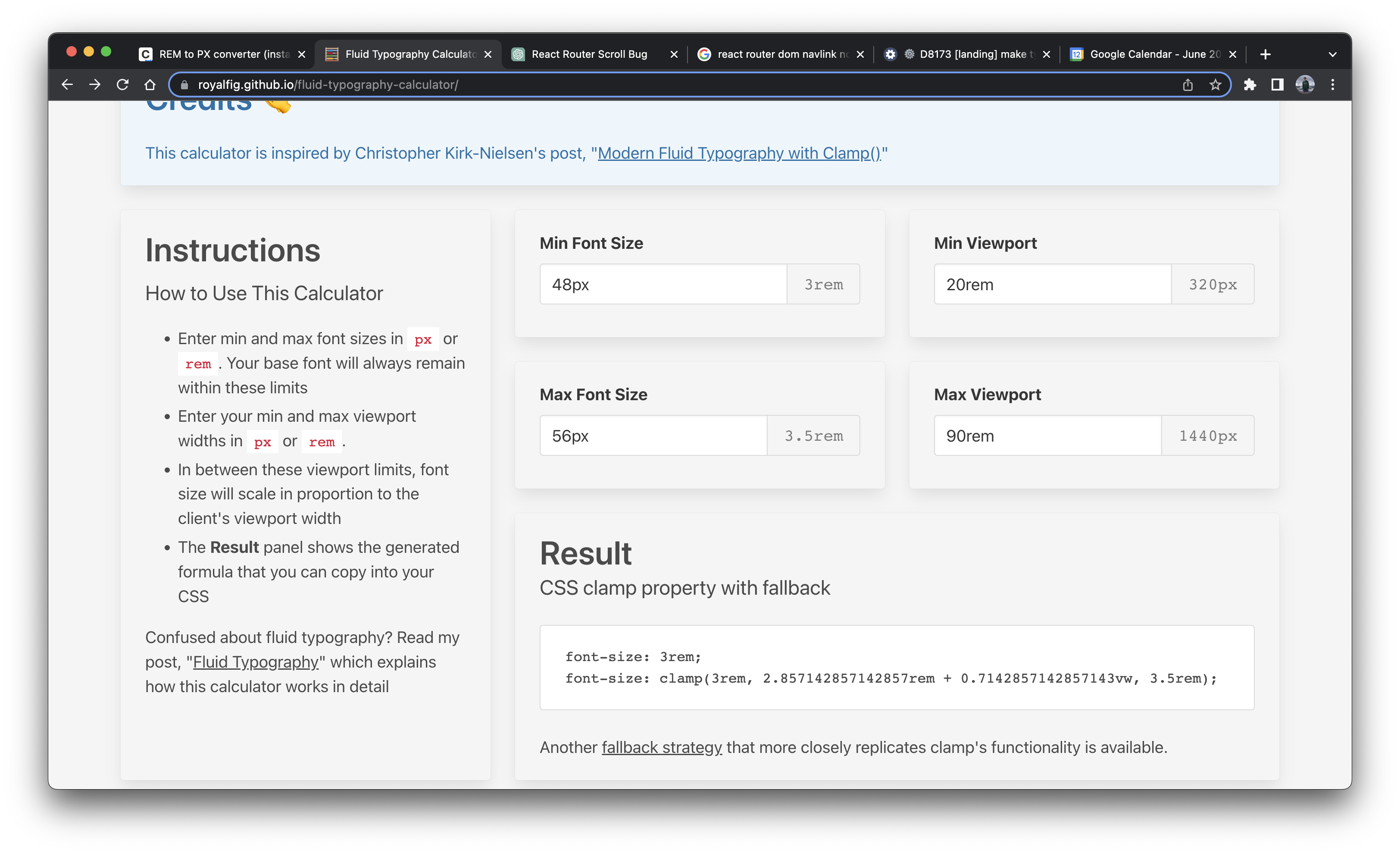
To figure out what the middle value of the clamp should be, I used a fluid typography calculator which took in four values: min font size, max font size, min viewport, and max viewport. I set the min/max font sizes based on what I did above, but for the min viewport I used 20rem (320px) and 90rem (1440px) which are media query breakpoint values found in the figma document.
Depends on D8172
Links to calculators used:
https://nekocalc.com/rem-to-px-converter
https://royalfig.github.io/fluid-typography-calculator/