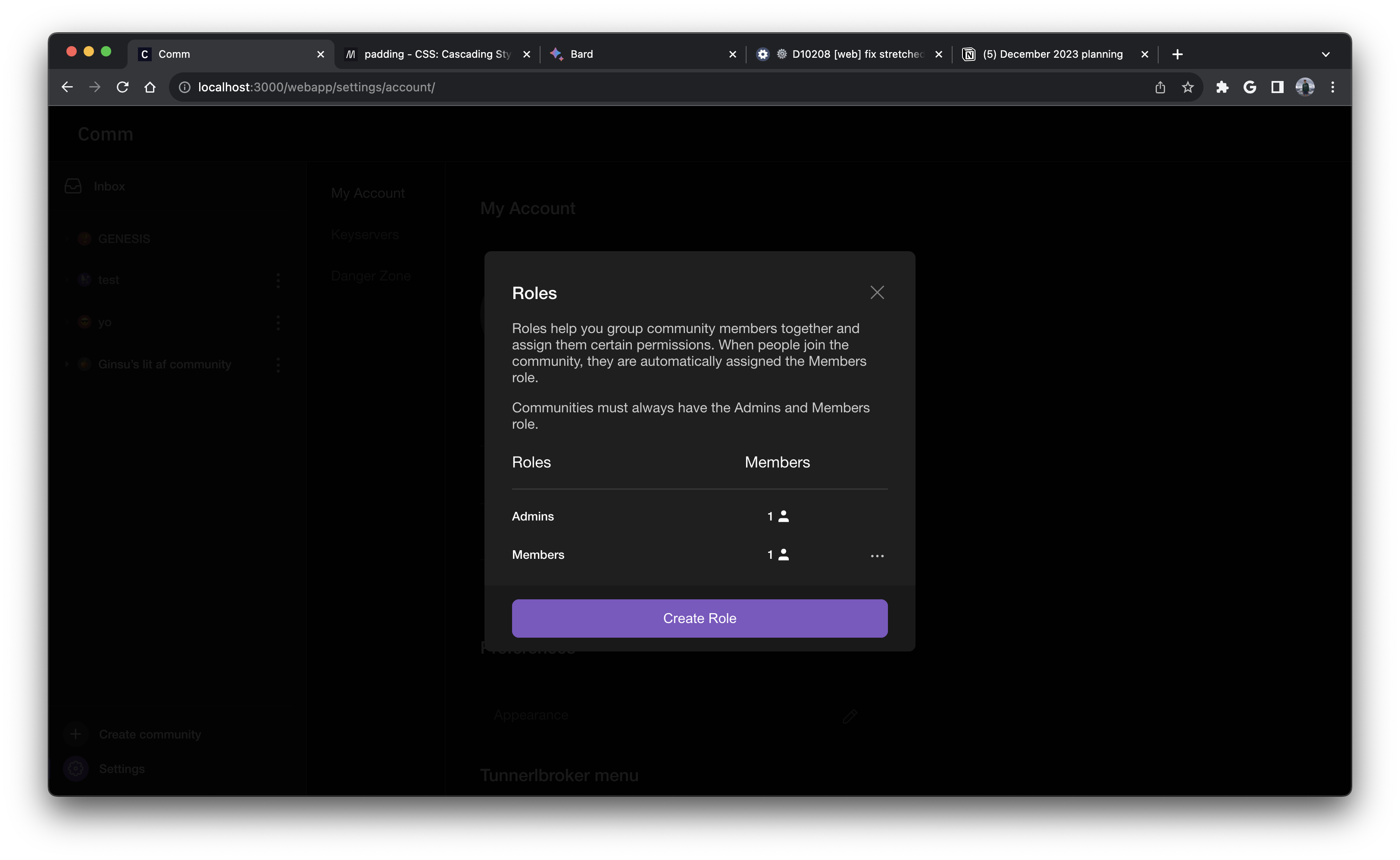
This diff updates the Modal component to follow the new style rules outlined by Ted in his web app redesign. Every modal should be following these new rules to create a more visually uniform look with our modals. The rules for the redesigned modals are outlined below
- New modals will include an “button section” that will be present in all modals that need buttons.
- The button section will always live on the bottom of the modal, and contain all the buttons needed.
- If there is only one button for the modal, then the button will fill up the entire space of the section with 32px on the sides and 16px top/bottom.
- All modals should have a 32px margin on the top and sides.
Here are some screenshots from the figma that help provide context for how the new modals should look visually
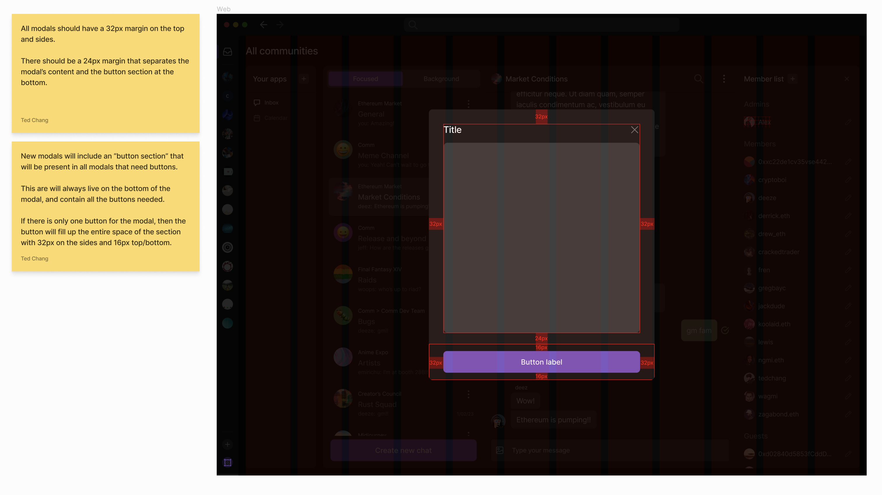
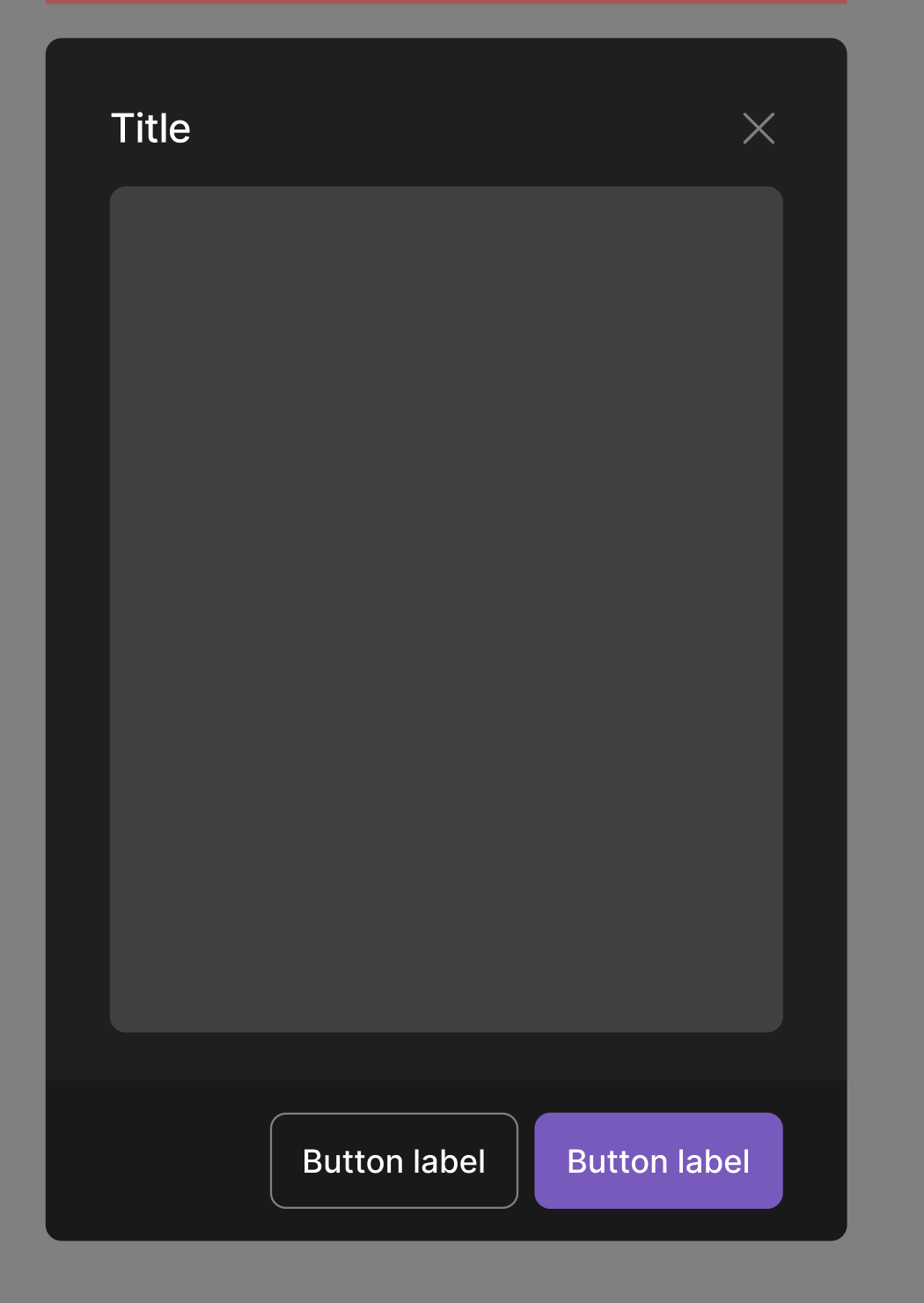
Here is another example from Figma better showing what the button section looks like (has a different shade of black for the background)
Please note that this diff will cause a bunch of regressions to our modals since pretty much all of our modals have their own one off spacing styles + buttons. This diff and subsequent diffs will not be landed until all modals are ready to be landed.
This diff just focuses on the new uniformed spacing + introducing the button container (with support for only a primary button). Subsequent diffs will handle extending the modal component props API to have support for secondary buttons, danger buttons, subheaders, etc.
Linear task: https://linear.app/comm/issue/ENG-5943/extendmodify-the-modal-props-api-to-follow-new-modal-designs