Page MenuHomePhabricator

[web] introduce secondary button prop to modal component
ClosedPublic

Authored by ginsu on Dec 8 2023, 11:32 AM.
Tags
None
Referenced Files
Unknown Object (File)
Apr 9 2024, 1:28 AM
Unknown Object (File)
Apr 8 2024, 1:47 PM
Unknown Object (File)
Apr 5 2024, 5:41 AM
Unknown Object (File)
Apr 2 2024, 9:26 AM
Unknown Object (File)
Mar 6 2024, 11:42 PM
Unknown Object (File)
Mar 6 2024, 11:11 PM
Unknown Object (File)
Mar 6 2024, 7:44 PM
Unknown Object (File)
Mar 6 2024, 7:24 PM
Subscribers

Details

Summary

Sometimes we need two buttons in our modals. This diff introduces a secondary button prop which will enfore style rules when there are two buttons in the modal.
The style rules for when there is a primary + secondary button are as follows:

  • If there are two buttons needed for a single modal, the secondary button may live in the button section next to the main button.
  • The secondary button can be outlined to show less visual hierarchy.
  • The buttons will only be as wide as the button’s text content and lie on the right side of the modal.

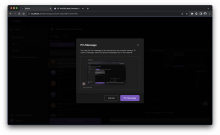
Here is a screenshot from figma showing how modals with primary + secondary should look visually:

Screenshot 2023-12-08 at 2.27.39 PM.png (1×3 px, 570 KB)

Linear task: https://linear.app/comm/issue/ENG-5943/extendmodify-the-modal-props-api-to-follow-new-modal-designs

Depends on D10242
Test Plan

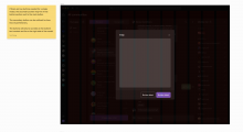
Here is an example of using the secondaryButton prop

Screenshot 2023-12-08 at 2.37.23 PM.png (1×3 px, 961 KB)

Diff Detail

Repository
rCOMM Comm
Lint
Lint Not Applicable
Unit
Tests Not Applicable

Event Timeline

web/modals/modal.react.js
105 ↗(On Diff #34443)

Switched up the rendering conditional logic here.

Initially I had rendering the primary button prop be the default, but I think we should render the emptyButtonContainerOffset by default instead.

There should be no case where we render just a secondary button in the button section for modals so I made this change with the intention that if a dev passed in a secondary button w/o a primary button on accident then we would just render the default emptyButtonContainerOffset.

I also thought of throwing an invariant if a dev did accidentally just passed in a secondary button, but I thought that might be too aggressive/been told in the past to use invariant sparingly

ginsu requested review of this revision.Dec 8 2023, 12:05 PM

There should be no case where we render just a secondary button in the button section for modals so I made this change with the intention that if a dev passed in a secondary button w/o a primary button on accident then we would just render the default emptyButtonContainerOffset.

Can we use the type system to enforce this so the "API"/contract of the component is more clear to developers? Something (loosely) like:

528d97.png (474×844 px, 66 KB)

where we get flow errors if we try to pass in a secondary button without a primary one?

atul requested changes to this revision.Dec 10 2023, 4:40 PM

Can we update the Props type to handle the "secondary button without primary button" scenario you described using the approach I mentioned in previous comment? That'll also allow us to make buttonContainer more concise and readable.

Feel free to re-request changes if there's anything I'm missing, or if changing the types leads to any additional issues.

web/modals/modal.react.js
106–127 ↗(On Diff #34443)

I think we can definitely make this more concise. Would something like the following work:

448c65.png (826×1 px, 166 KB)

(Assuming we update Props to enforce that secondaryButton can only exist when there's a primaryButton)

This revision now requires changes to proceed.Dec 10 2023, 4:40 PM

Thanks for taking time to address feedback, looks a lot cleaner!

This revision is now accepted and ready to land.Dec 12 2023, 11:19 AM
This revision was landed with ongoing or failed builds.Feb 15 2024, 12:10 AM
This revision was automatically updated to reflect the committed changes.