Page MenuHomePhabricator

[web] cleanup account delete modal
ClosedPublic

Authored by ginsu on Dec 12 2023, 12:49 PM.
Tags
None
Referenced Files
Unknown Object (File)
Apr 8 2024, 2:33 PM
Unknown Object (File)
Apr 8 2024, 2:33 PM
Unknown Object (File)
Apr 8 2024, 2:33 PM
Unknown Object (File)
Apr 8 2024, 2:32 PM
Unknown Object (File)
Apr 8 2024, 2:32 PM
Unknown Object (File)
Apr 8 2024, 12:25 PM
Unknown Object (File)
Mar 6 2024, 10:12 PM
Unknown Object (File)
Mar 6 2024, 10:09 PM
Subscribers

Details

Summary

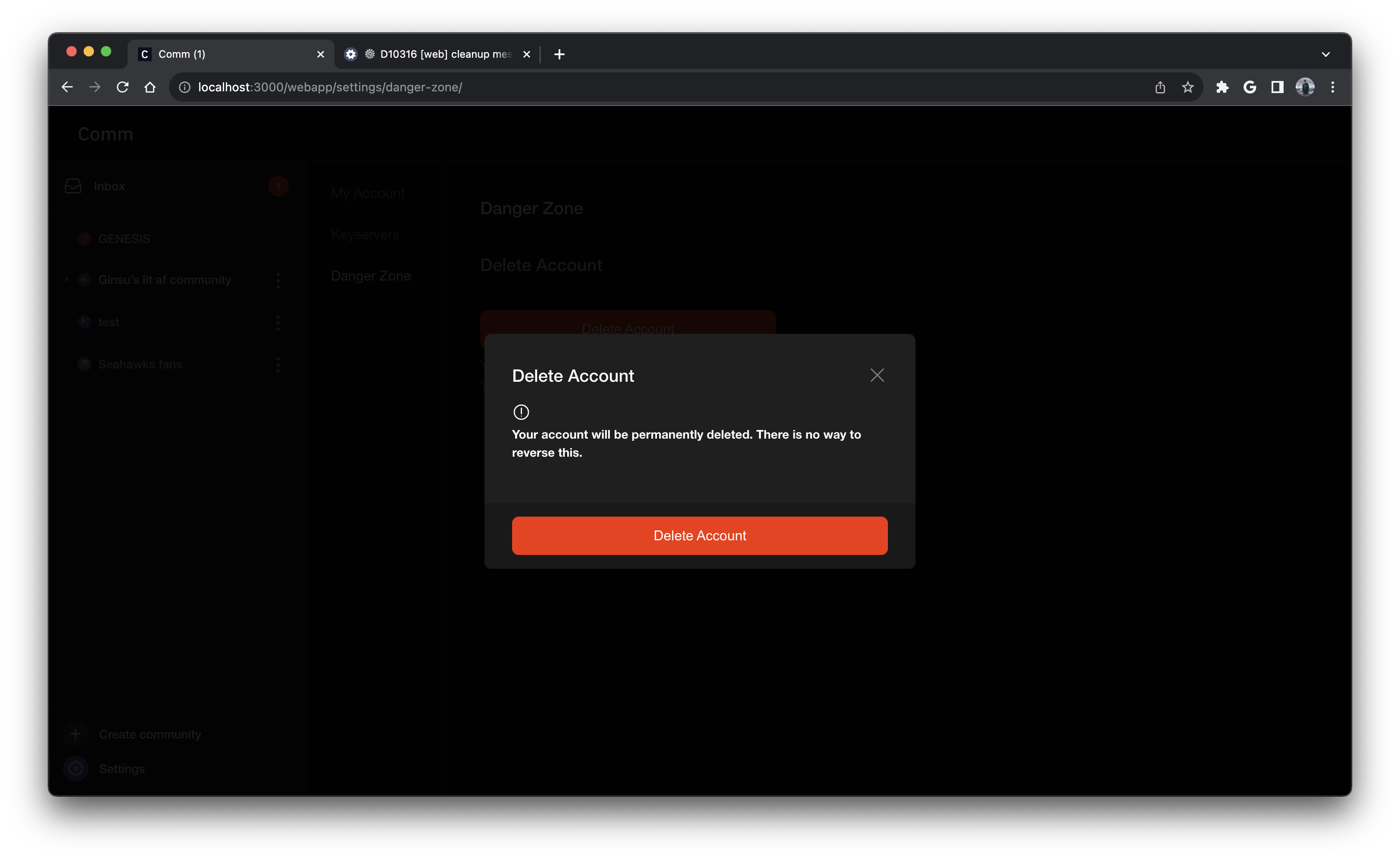
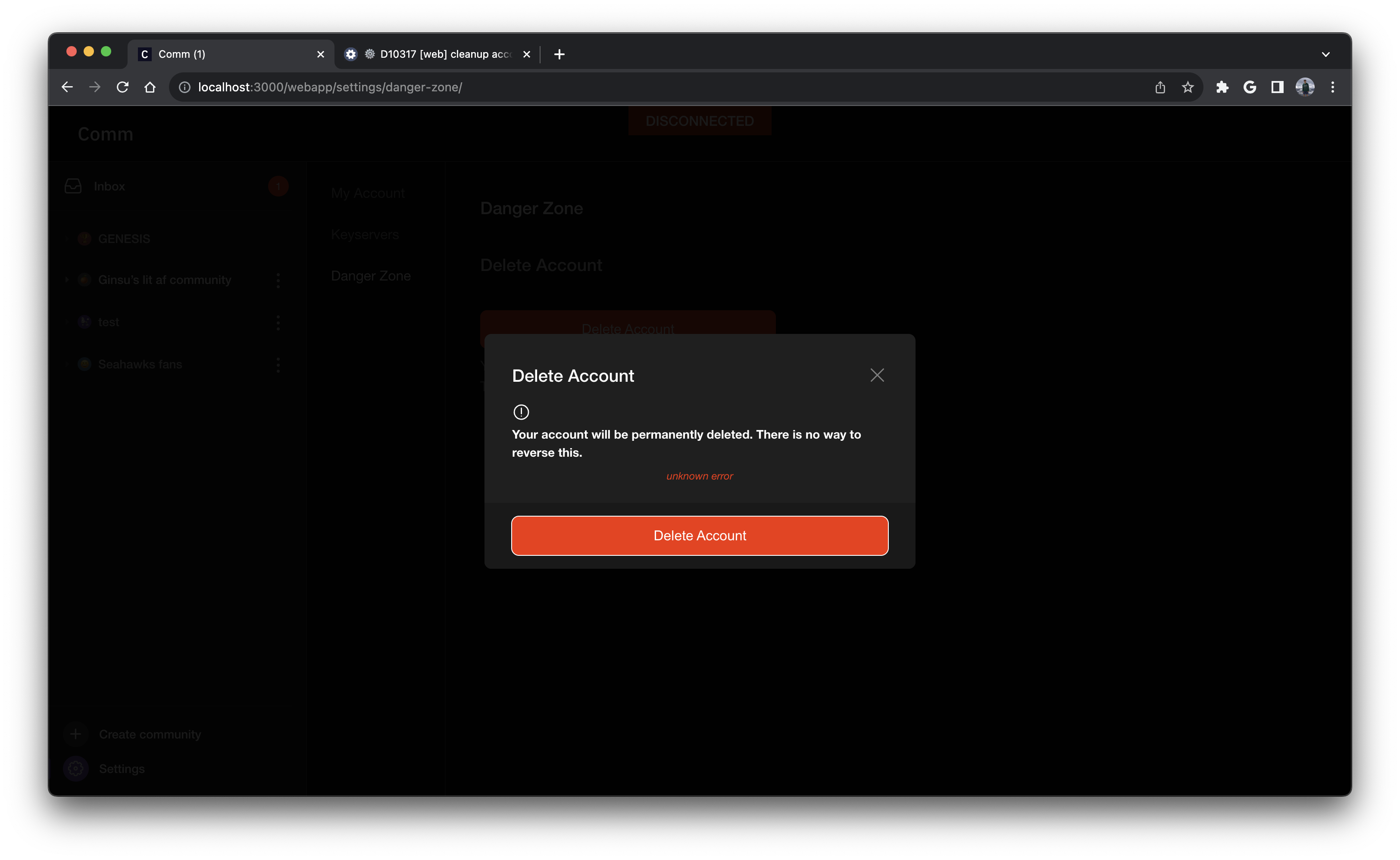
This diff cleans up the one off styles in the account delete modal and replaces it with styles of the redesigned modal.

Linear task: https://linear.app/comm/issue/ENG-5943/extendmodify-the-modal-props-api-to-follow-new-modal-designs

Depends on D10316

Test Plan

Please see the screenshots below

Screenshot 2023-12-12 at 3.50.49 PM.png (1×3 px, 729 KB)

error case:

Screenshot 2023-12-12 at 3.51.50 PM.png (1×3 px, 740 KB)

Diff Detail

Repository
rCOMM Comm
Lint
Lint Not Applicable
Unit
Tests Not Applicable

Event Timeline

ginsu requested review of this revision.Dec 12 2023, 1:19 PM

Looks good - just one comment inline.

Also just a personal opinion on the design of the modal (I know you didn't introduce the change in this diff so no changes are needed here), but I think the little ! circle icon would look better inline with the text, either in its own column side-by-side to the text, or just next to the first line of text. Not a big deal though, just wanted to call it out

web/settings/account-delete-modal.css
22 ↗(On Diff #34542)

Could be good to be consistent with the file (maybe either make this error_placeholder or make everything else camel case)

This revision is now accepted and ready to land.Dec 12 2023, 1:26 PM

Also just a personal opinion on the design of the modal (I know you didn't introduce the change in this diff so no changes are needed here), but I think the little ! circle icon would look better inline with the text, either in its own column side-by-side to the text, or just next to the first line of text. Not a big deal though, just wanted to call it out

I think side by side would look better too, I can make that change if we are all aligned on it.

cc @ashoat @atul

web/settings/account-delete-modal.css
22 ↗(On Diff #34542)

Sorry should have called this out, but the very next diff does switch the casing for each style to be camel case

update icon and text to be side by side + rebase before landing

This revision was landed with ongoing or failed builds.Feb 15 2024, 12:44 AM
This revision was automatically updated to reflect the committed changes.